Skyline
An FMCG brand identity forged in the discipline and style of the ride
Transforming a bottle into a culture-first performance brand. A strategic FMCG brand identity shaped for people who want to signal an active lifestyle.
Skyline had the technical backbone of a seasoned OEM manufacturer but no cultural or strategic foundation to compete as a consumer-facing performance brand. The category leans heavily on camping, weekend outdoorsy cues, and playful Gen Z aesthetics, which makes the shelves feel interchangeable. To build an identity that could separate, Mude ran a market research phase to find where Skyline could credibly plant a flag.
You can read more about the project in our featured interview with The Brand Identity
The brief
Skyline’s founder had spent years as an OEM manufacturer producing premium drinkware for other companies to put their names on. The founder had built strong manufacturing capability in China, producing bottles for companies like 3CE, Starbucks, and Disney, but always as the supplier behind someone else’s label. The decision to build a Skyline brand came from seeing a gap: they were making the product other brands were selling, the quality was there, but the sports bottle category in Australia didn’t have a brand that combined real performance engineering with a design standard that matched what consumers expect from their other gear.
There was no Skyline brand presence, no visual identity, and no positioning that would give the company a reason to charge what the product is worth.
The brief was to build something that felt like it belonged alongside brands like Rapha and Arc’teryx in terms of design standard and cultural positioning, not alongside the lifestyle drinkware brands that dominate the category. Australia made sense as the pilot market because the consumer base is smaller than the US but more discerning, with strong health awareness and an outdoor culture that creates natural demand for a brand positioned this way.
A few specific patterns came out of the competitive audit. The first was the colour-as-personality move, where brands like Frank Green and Hydro Flask treat the colour range as the main reason to choose one bottle over another. Frank Green has built a credible position with the aesthetically-aware young professional, particularly the female buyer in inner-city Melbourne and Sydney who treats the bottle as part of an outfit and the brand as a sustainability credential. Hydro Flask leans on a wider rainbow palette and an everyday-hydration story that lives closer to high-school identity and colour-coded social belonging than serious training.
The second pattern was the outdoorsy camping aesthetic that dominates brands like Nalgene and YETI: soft earthy tones, nature photography, lifestyle settings that could belong to any weekend warrior brand. Nalgene anchors in a utilitarian summer-camp and university-outdoor-club credibility: the dialect is competence, function-first, deliberately anti-fashion. YETI anchors in rugged American outdoor masculinity that started with hunters and fishermen and has expanded carefully into broader sportsman lifestyle without losing the original posture; the brand reads as belonging to the kind of person who actually owns a truck and uses it.
The third was the sustainability-first positioning that Frank Green and Fressko lead with, which is well-executed but crowds out performance credibility. Fressko leans specifically into Melbourne coffee culture and family-oriented ritual, which gives it a particular kind of warm, domestic credibility. Stanley, for its part, has ridden a viral moment by turning a heritage thermos brand built for tradesmen into a fashion accessory aimed at a trend-driven, largely suburban-American audience, a case of a subculture choosing the brand rather than the other way around.
Each one has anchored itself in a specific subculture that gives the brand its currency, and each of those subcultures is somewhere other than cycling, endurance sport, or serious athletic discipline. That was the gap.
The closest comparable brand outside the category is Pinarello, a cycling brand that has earned the right to charge a premium because it has done the strategic work to be more than gear. Skyline’s opportunity was to take that posture into drinkware. The question we wanted the work to answer was one the rest of the category had dodged: what does a performance water bottle brand actually look and behave like?
Skyline sits inside the broader Consumer Packaged Goods (CPG) category as a challenger brand entering a sector dominated by lifestyle-led incumbents. Mude built the project around a brand positioning approach, running full FMCG market research, mapping category convention, and engineering a brand position that gives Skyline pricing room against established players. The result reads as performance brand identity rather than lifestyle drinkware.
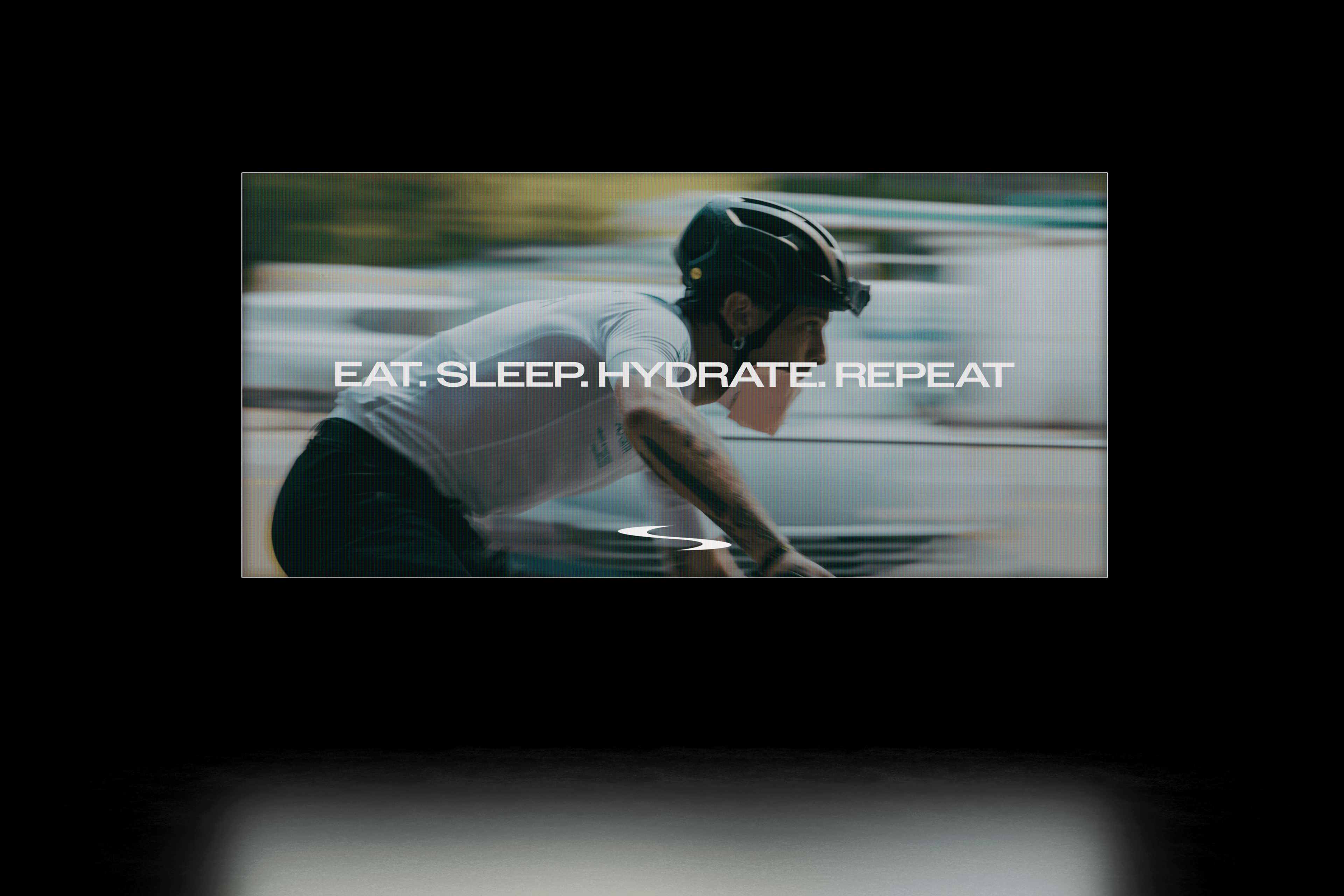
Cycling became the cultural anchor. It carries the specific signals Skyline needed: discipline, precision, endurance, ambition. Anchoring in that world means Skyline behaves more like performance gear than an everyday FMCG product, with a cultural home that gives the brand room to grow into other endurance sports without losing its posture.
The cycling subculture wasn’t ours to invent. It existed long before Skyline did, with its own ways of telling who rides and who doesn’t, and its own currency among the people who take it seriously. The work was about earning the brand a credible place inside it, so Skyline could become useful to a tribe that already knew its own signals. The cycling reference sits in the brand’s posture and form language rather than in literal cycling symbols, the sport informs the aesthetic standard rather than showing up as explicit, literal representations.
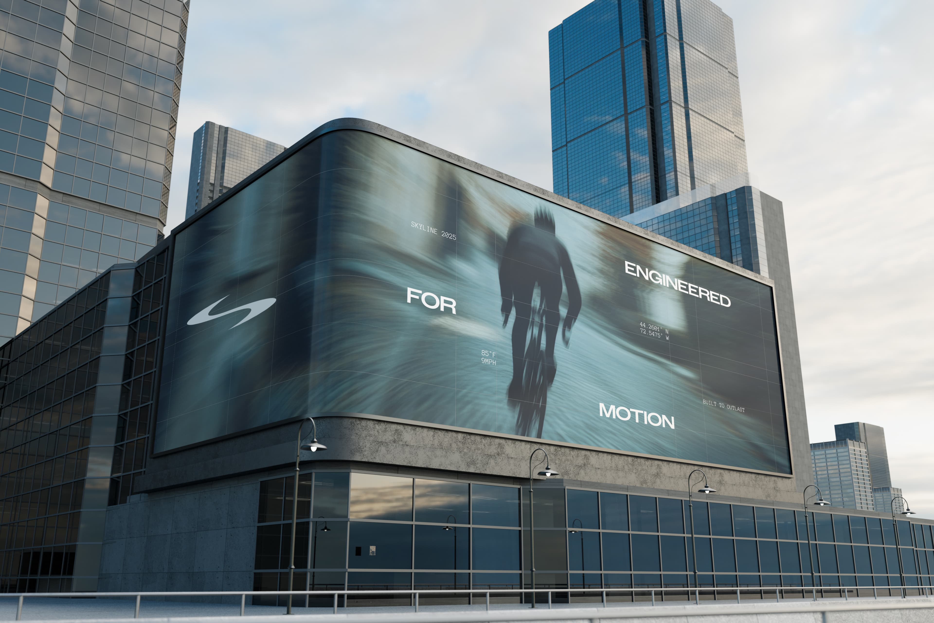
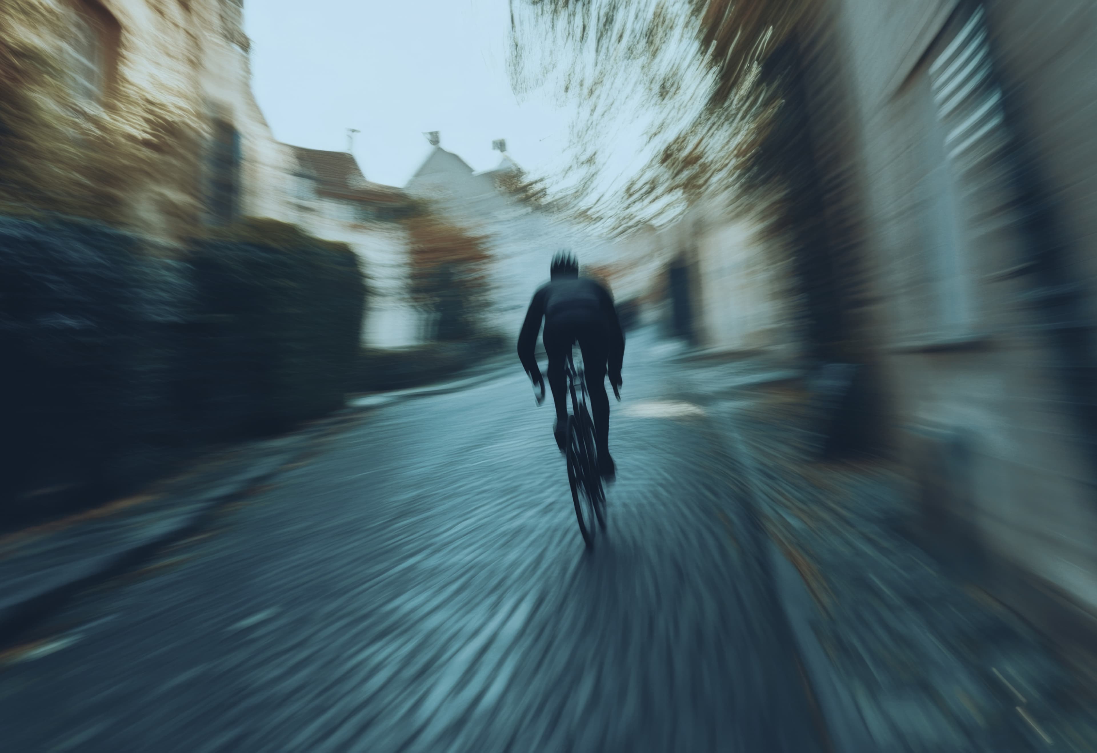
We were conscious throughout that if you put a cyclist on the bottle, you’ve made cycling merchandise. If you let cycling’s visual discipline shape how the brand behaves, you’ve made performance gear that a cyclist would recognise as belonging to their world. That distinction guided everything from photography direction to packaging.
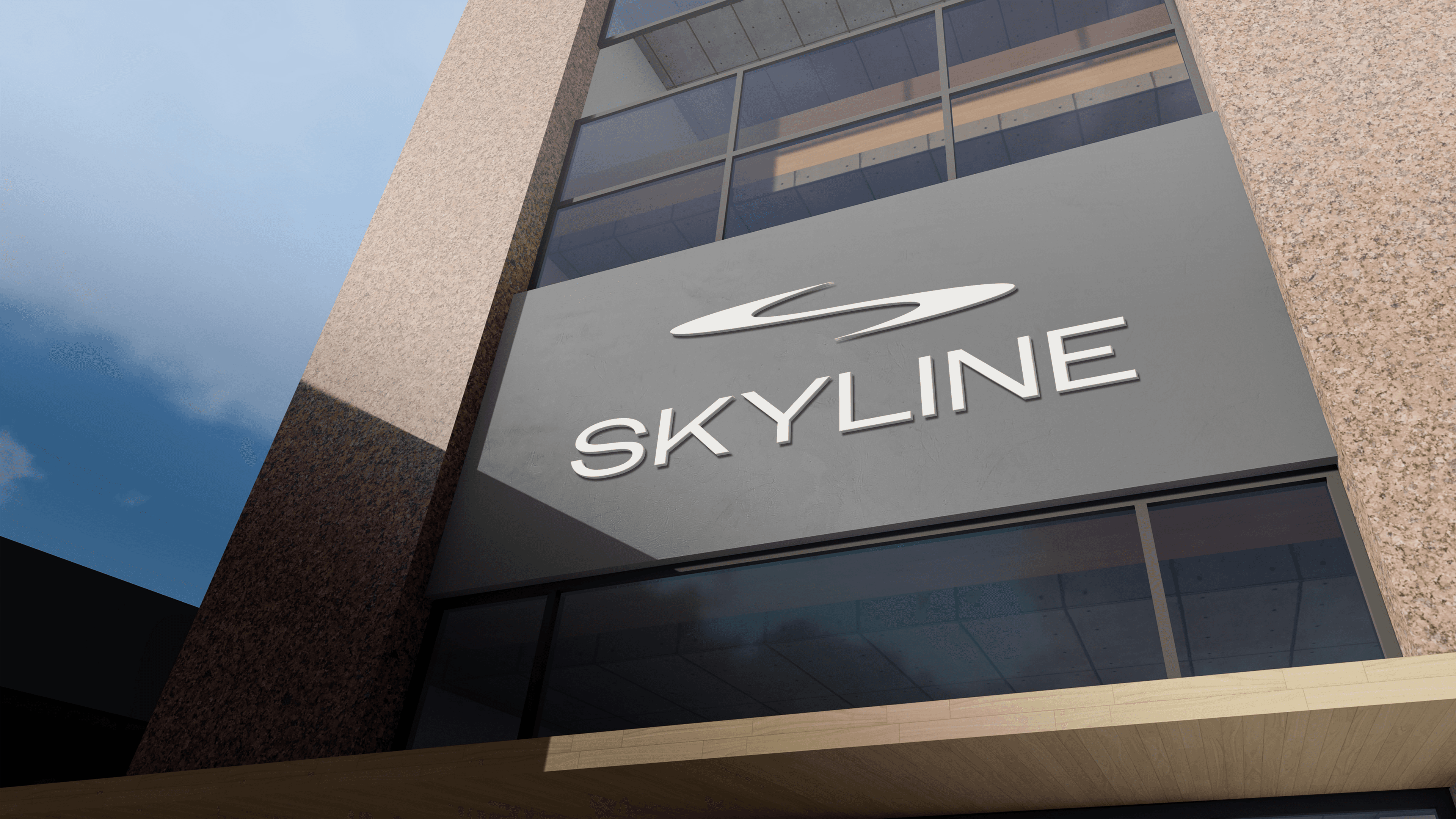
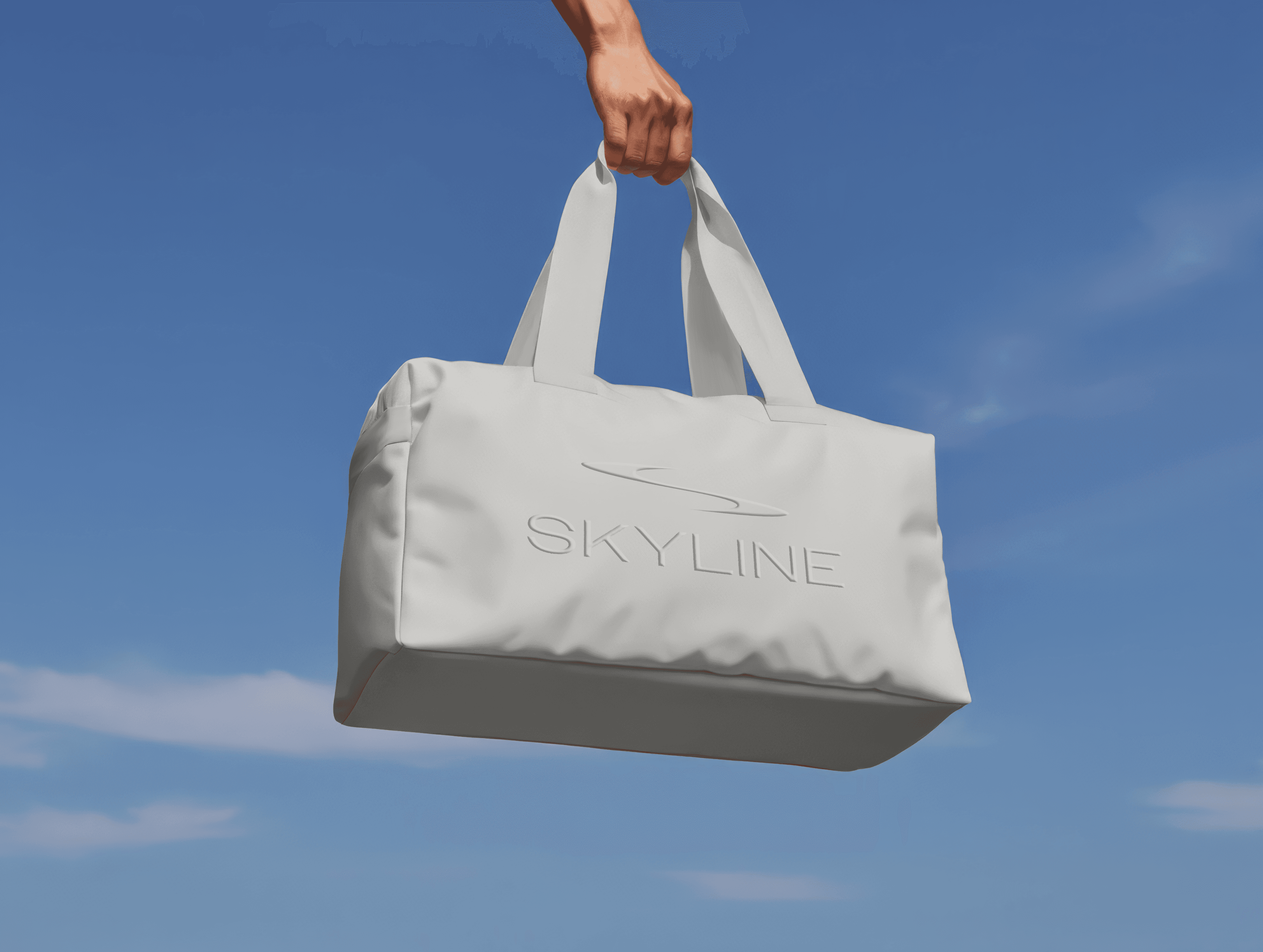
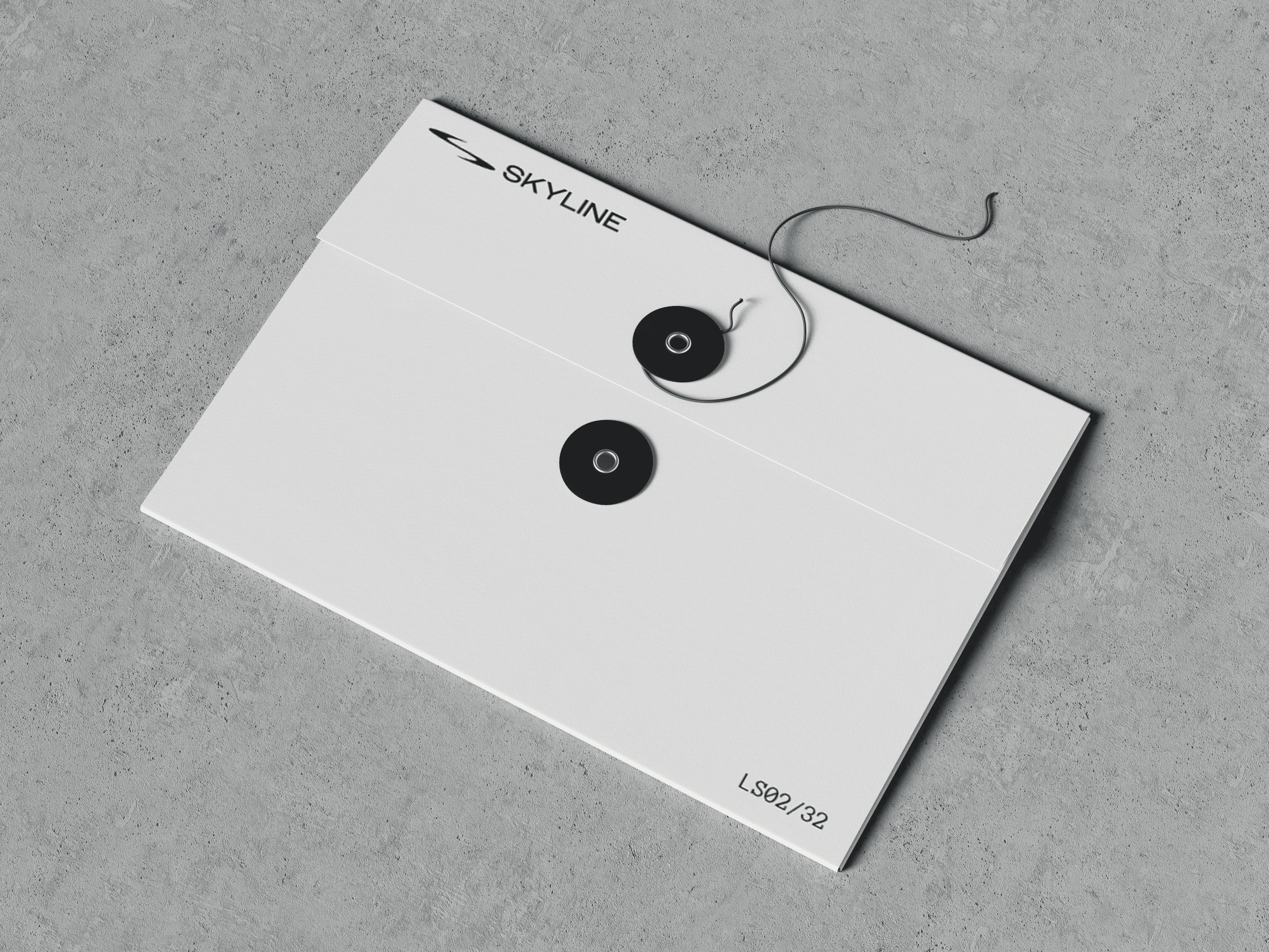
The brandmark
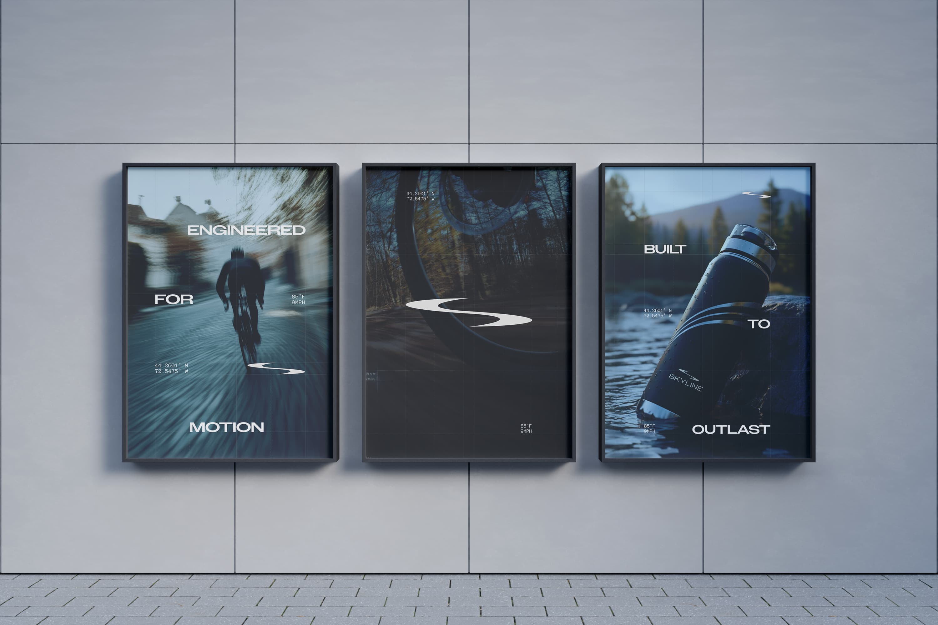
The symbol needed to work at two scales: embossed small on a bottle cap and large on outdoor advertising. Mude started with the letter S for Skyline and shaped it into a sinuous road trail, the kind of winding descent you’d see on a mountain road. It reads as forward momentum and speed without needing a bike or a wheel anywhere in the mark.
The wordmark sits in extended, geometric capitals with open tracking, keeping it legible at the small sizes that matter on packaging while giving it a technical tone that matches the engineering feeling we were going for through the rest of the system.
Typography
The primary typeface is Owners XWide, used for headlines and display. It’s a geometric, extended sans-serif with angular letterforms that match the product design language. Everything in Skyline is built around sharp edges and forward-leaning proportions, and Owners XWide makes headlines feel harder.
The secondary typeface is Anonymous Pro, a monospaced font used for overlines, labels, subheadings, and navigation. Monospaced type carries an inherent association with technical systems and data readouts, which reinforces the engineered positioning without needing to say it. It shows up across category labels, product identifiers, and section intros, creating a technical cadence that runs through every touchpoint.
Body copy sits in Sofia Pro, which is warmer and more readable at small sizes for product descriptions and website copy.
Colour
The palette is monochromatic and deliberately narrow, in the same way a lot of other elite cycling brands feel. We wanted to borrow from the category cues you find in other performance cycling and technical gear: carbon fibre, titanium, the matte finishes that are associated with that category.
Mude treated the palette as a positioning decision more than an aesthetic one. The drinkware category often uses colour as its main differentiator: Frank Green through pastels, Stanley through seasonal drops, Hydro Flask through a full rainbow. The premise of the whole category is that colour creates the choice. Stripping the palette back gives Skyline an immediate visual edge against shelves of pastel and rainbow competitors, and lets the product itself become the focus rather than the colour story.
Art Direction
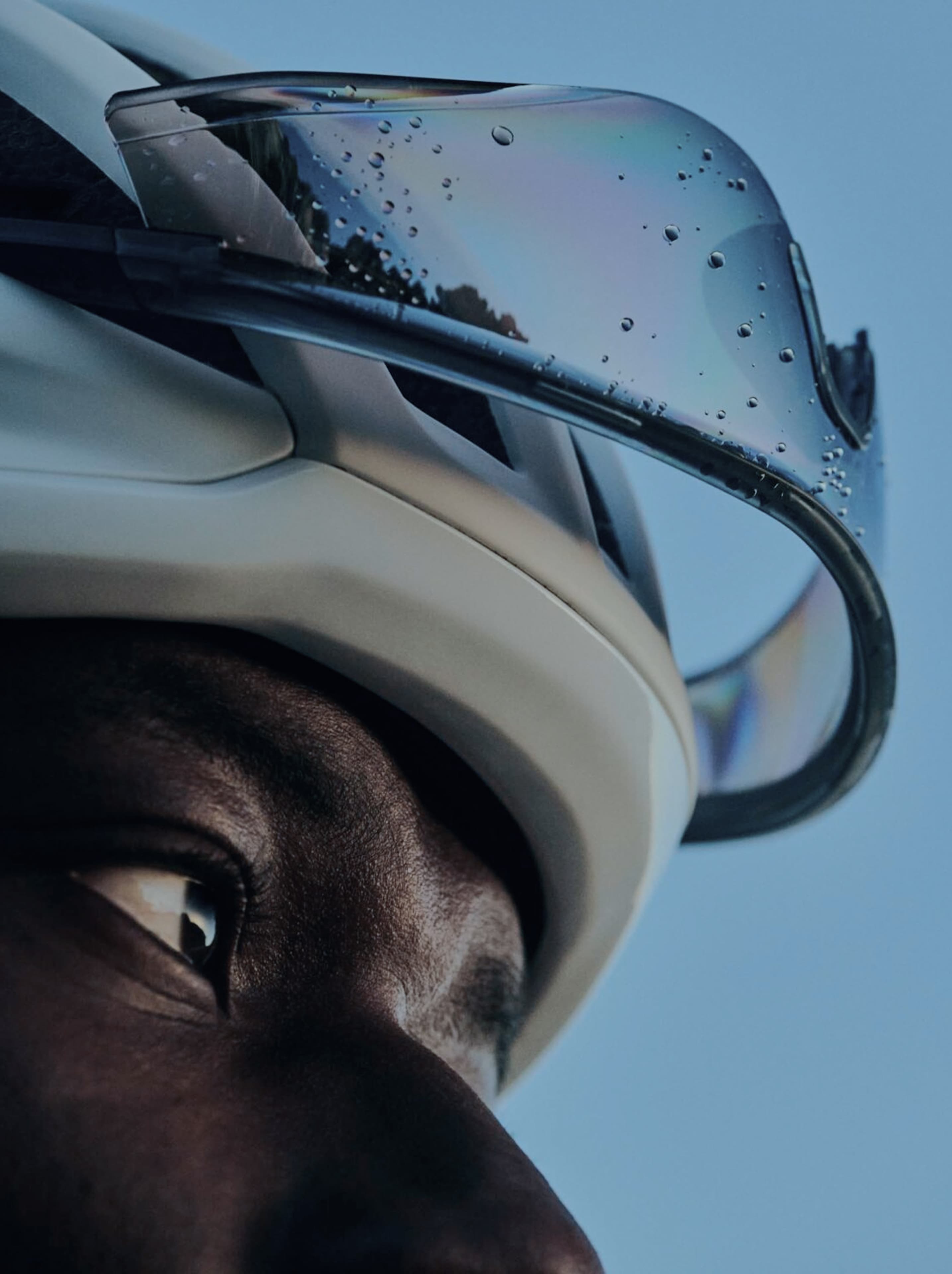
The art direction draws from road cycling’s visual culture: motion blur, low angles, early morning and late evening light. The team really leant into a ‘blue hour’ look with the photography, which we hoped would cognitively draw people to the ‘get up before the crack of dawn’ level of cold discipline that the brand wanted to honour. That atmosphere is very much how we wanted to signal that this is the kind of brand for someone who wants to have an affinity for an active, disciplined lifestyle.
The system flexes between two registers: a darker, more cinematic tone for brand storytelling, social and outdoor advertising, and a cleaner, brighter treatment for the e-commerce experience where product browsability matters. The founder raised this specifically in the workshops: the brand world should feel dark and understated, but the shop experience needs to make browsing easy.
Related Projects
View Project
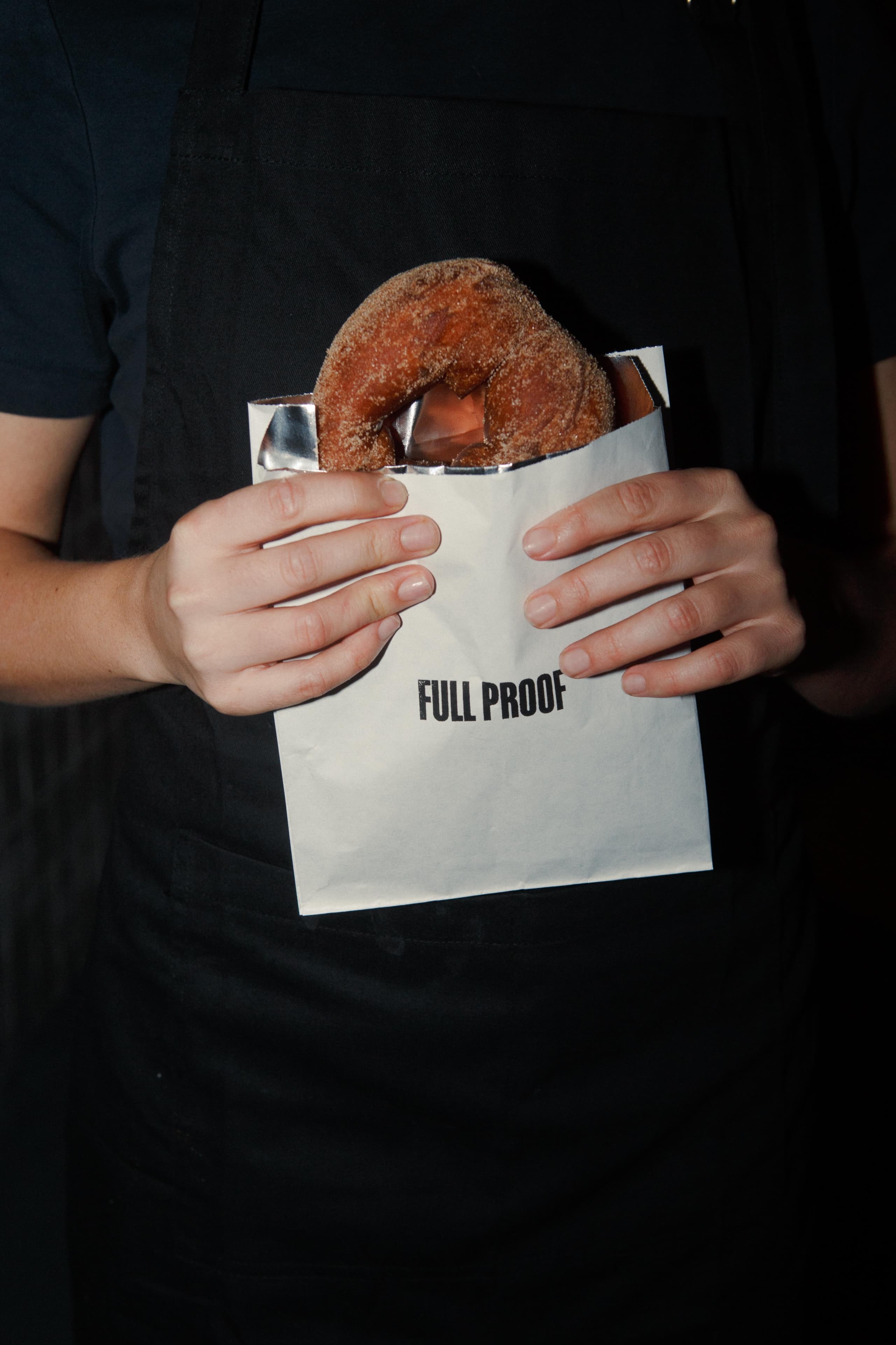
Brand
Full Proof
View Project
Brand, Graphic Design
ByAsia Food
Pentawards 2023 Shortlist
1View Project
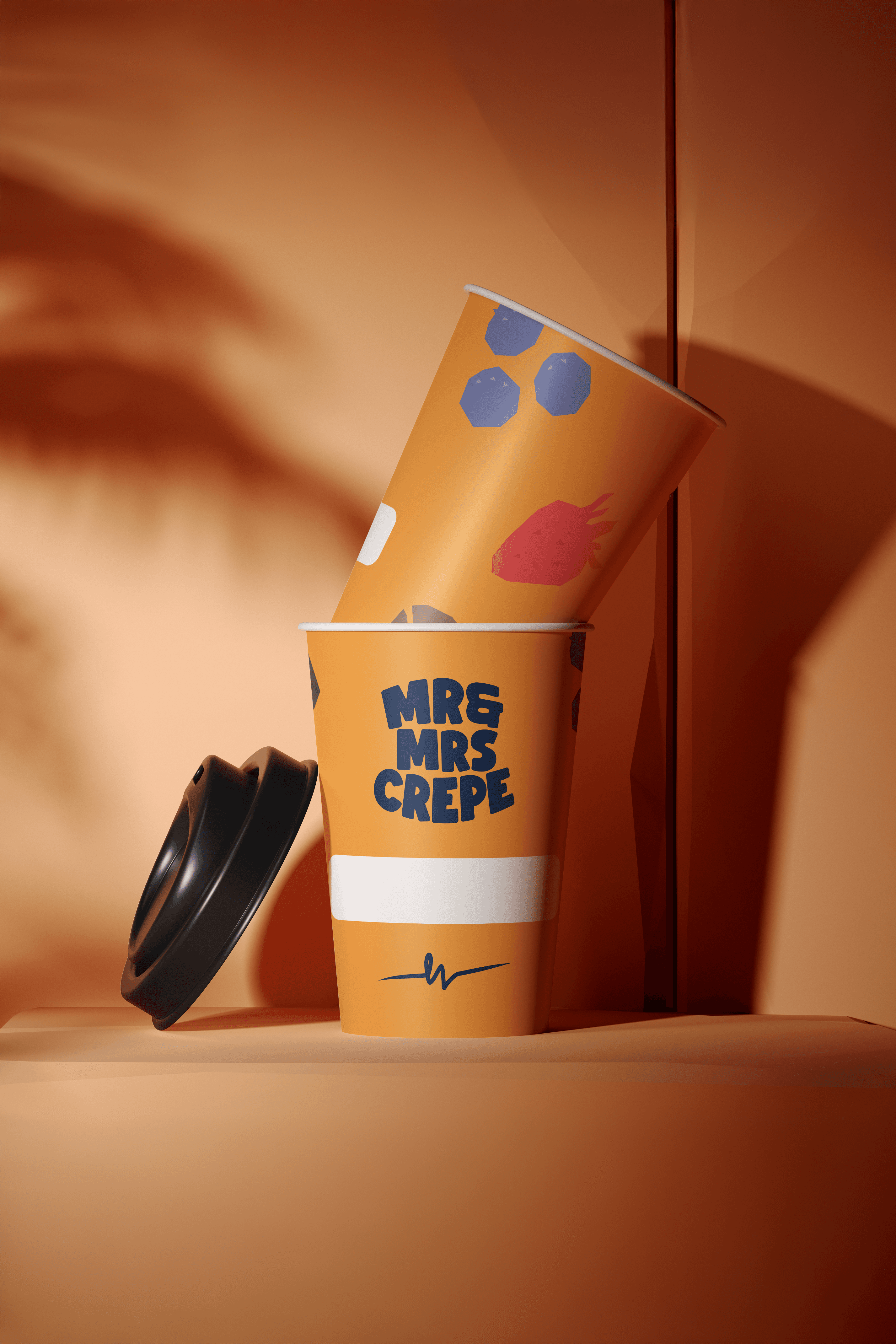
Brand, Graphic Design
Mr & Mrs Crepe
View Project
Website
The Embassy of France in Australia
View Project
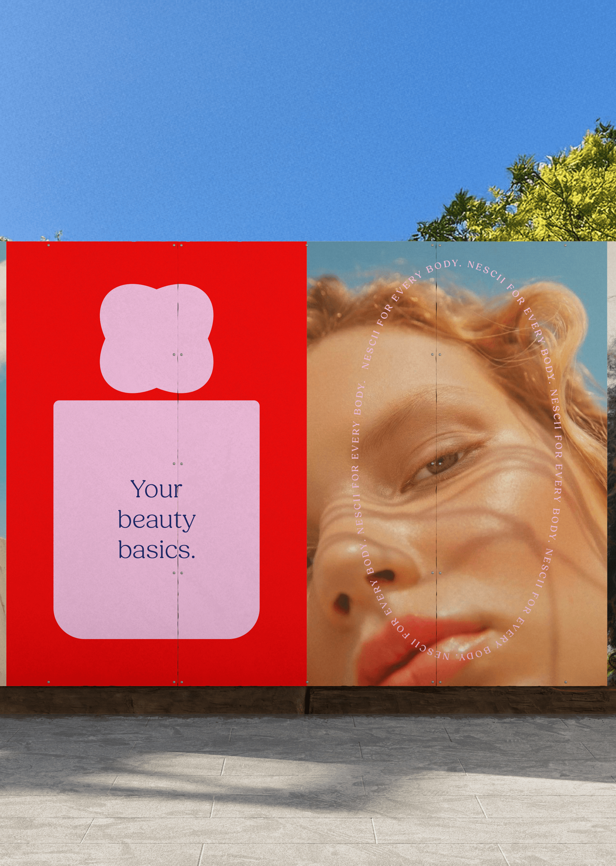
Brand
Nescii
View Project
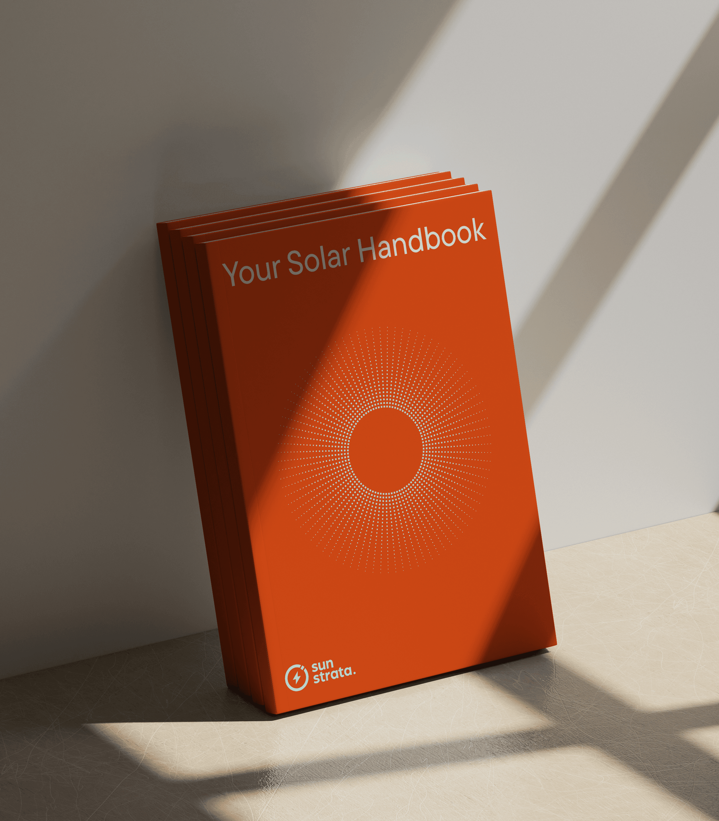
Brand, Website
Sunstrata
View Project
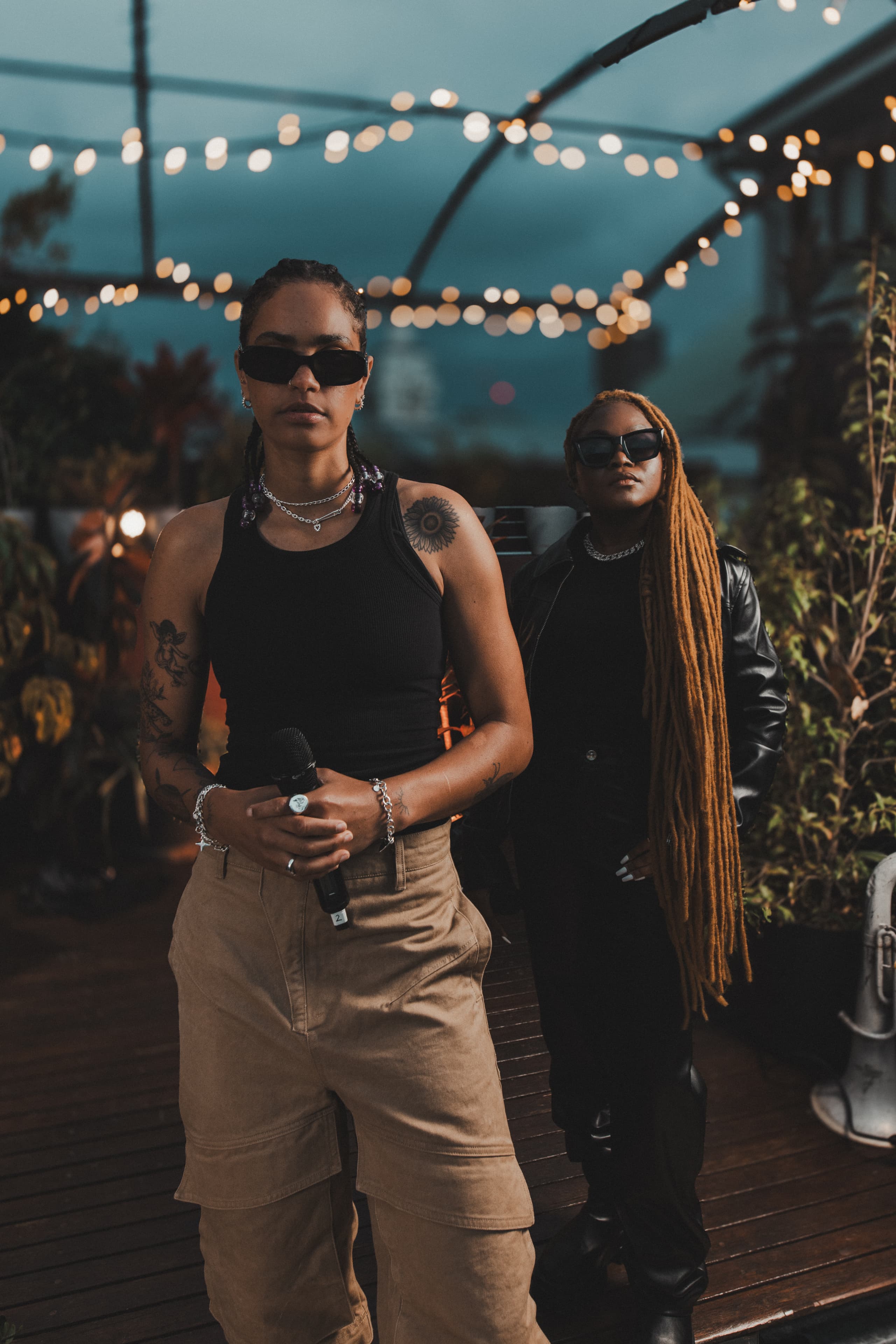
Brand, Video
Mood on the Roof
Webby Awards Nominee
2View Project
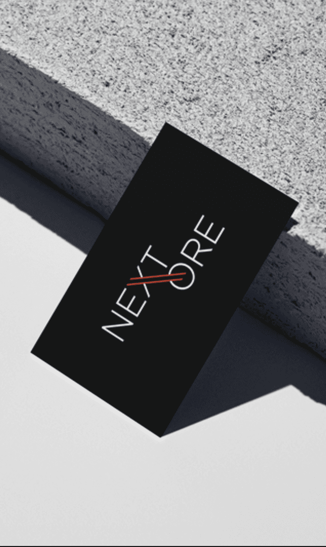
Brand, Website
NextOre
Frequently Asked Questions
Building an FMCG brand in a category dominated by colour
FMCG stands for fast-moving consumer goods. The category covers products that sell quickly at relatively low cost and are consumed daily or weekly. Categories typically classified as FMCG include packaged food and beverages, personal care and cosmetics, household cleaning, over-the-counter pharmaceuticals, pet products, drinkware and reusable consumer goods.
What separates FMCG from other categories is the velocity of purchase and the role of brand at the point of decision. FMCG buyers usually make purchase decisions in seconds, often at shelf or on a phone screen, with limited consideration. Brand identity, packaging design and positioning carry heavy weight in FMCG, beyond considered-purchase categories where buyers research before they commit.
Skyline is an FMCG brand operating in the premium drinkware category alongside brands like Frank Green, Hydro Flask, Stanley, YETI, Nalgene and Fressko
FMCG brand identity has three constraints corporate and B2B brand identity can afford to skip.
The first is shelf and screen. The brand has to compete at retail and on phone screens, often in less than two seconds of consumer attention. That raises the design standard on logomark, colour and packaging. Every element has to read clearly at low resolution and in peripheral vision.
The second is category convention. Drinkware leans on colour as personality. Energy drinks lean on aggressive graphic systems. Snack categories lean on appetite cues. An FMCG brand that doesn’t engage category conventions deliberately ends up looking either generic or alien.
The third is subculture credibility. Consumer buyers care whether a brand belongs to a tribe they recognise. Corporate buyers care whether a brand looks legitimate. The signals are different.
The Skyline system answers all three: a monochromatic palette designed against a colour-dominated category, a brandmark engineered for embossed and printed packaging at small scale, and a cycling cultural anchor that gave Skyline a tribe.
The Skyline palette is monochromatic. Carbon fibre, titanium, matte greys. That decision is the brand’s primary positioning move.
The drinkware category is dominated by colour. Frank Green built its position on pastels aimed at the inner-city female buyer who treats the bottle as part of an outfit. Hydro Flask runs a full rainbow that lives closer to high-school identity than serious training. Stanley rides seasonal colour drops as part of its viral trend cycle. The category premise is that colour creates the choice.
A monochromatic palette removes Skyline from that category logic entirely. Against a shelf of pastel and rainbow competitors, the absence of colour reads as restraint, and restraint is the signal a performance category uses. The palette borrows directly from elite cycling and technical gear vocabulary: matte finishes, raw material tones, the visual language of carbon fibre, anodised aluminium and titanium.
Performance brand positioning and lifestyle brand positioning compete for adjacent audiences and carry different design vocabulary.
Performance brands (Rapha, Pinarello, Arc’teryx, Skyline) lead with discipline and material restraint. The visual register is technical, monochromatic, motion-led. The cultural reference is a specific sport or discipline subculture. The buyer cares whether the brand reads as belonging to their training community.
Lifestyle brands (Frank Green, Stanley, Hydro Flask) lead with personality and visual variety. The visual register is colour-driven, seasonal, fashion-adjacent. The cultural reference is aspirational lifestyle without a specific discipline. The buyer cares how the product looks alongside the rest of their identity.
Heritage and outdoor brands (Nalgene, YETI, classic outdoor lines) lead with function-first or rugged-outdoor vocabulary. Utilitarian, anti-fashion, often consciously dated as a credibility signal, or anchored in specific outdoor traditions like hunting, fishing or expedition use.
The audience overlap exists. The buyer in each segment cares about different things. Skyline is positioned in performance, not lifestyle or outdoor. The monochromatic palette, the cycling subculture anchor, the technical typography choices, the cinematic blue-hour photography all read performance.
FMCG market research is the discovery work that maps category convention, identifies positioning gaps and tests assumptions before brand identity work begins. It’s the foundation everything downstream is built on. Without it, brand identity work is guessing.
A working FMCG market research phase typically covers:
- Competitive audit, every meaningful brand in the category, mapped by visual register, price point, distribution channel and cultural reference
- Category convention mapping, what visual codes the category leans on, where the conventions cluster, where the gaps are
- Audience and subculture research, who buys, what they signal by buying, what tribes they belong to
- Pricing analysis, where the category prices, what the premium tier looks like, what the brand has to earn to justify a price point
- Retail and channel research, where the category sells, what buyers respond to at shelf, what the e-commerce experience looks like
Skyline’s market research phase covered all of the above, with cycling subculture analysis added as a focused track. The result was the category gap that became the brand position: performance positioning in a category dominated by colour-led lifestyle brands.
Mude treats FMCG market research as the opening phase of major consumer brand engagements, not as a standalone quantitative research service (that scope sits with research specialists like Roy Morgan, Ipsos or Nielsen). It runs as the strategic discovery that conditions the brand identity work downstream.
A cultural brand earns its place inside an existing subculture. Cultural brands behave like members of the tribe they’re serving. They understand the visual codes, vocabulary and behavioural signals that mark belonging, and they put those signals to work.
The opposite of a cultural brand is a manufactured brand. Built from positioning workshops, demographic research and category convention, without a genuine subculture root. Manufactured brands are competent and often interchangeable. Cultural brands are distinctive because the subculture they belong to is distinctive.
Skyline is positioned as a cultural brand in cycling and endurance sport. The visual discipline (monochromatic, technical, restrained), the photography direction (motion blur, low angles, blue hour), the typography choices (geometric extended caps, monospaced labels) all carry signals that cycling subculture recognises as belonging to its world. Skyline didn’t invent the subculture and didn’t try to. The brand work was about earning a credible place inside it.
FMCG branding and packaging design are adjacent disciplines that often run together. They address different layers of the consumer experience.
FMCG branding is the strategic and identity work. Brand positioning, visual identity system, brand voice, photography direction, the overall brand architecture. The output is a system that holds across packaging, retail, digital, advertising and content over time.
Packaging design is the specific application of brand identity to the physical packaging consumers buy. The output is the bottle, the box, the label, the carton. The actual product-as-sold artefact.
Most premium FMCG engagements include both because the disciplines reinforce each other. Brand identity without packaging design produces a strategy without a product to sell. Packaging design without brand identity produces a pretty bottle without a position.
The better a manufacturer’s product, the more value it tends to hand to someone else. As a contract supplier you are paid to make the product; the company whose name goes on it is paid for what that product means to a buyer, and that meaning is almost always worth more than the manufacturing. It also leaves you swappable, because there is always another factory that can quote low, and the work stays at the mercy of price until the manufacturer owns a brand people ask for by name.
Skyline is the apparent version of this Mude has worked on. Its founder could already make drinkware for some of the world’s recognisable brands. Selling those same bottles under other companies’ names gave the business no way to charge what they were worth. The company had a strong product and no position behind it, nothing for a buyer to attach to. Mude’s job was to build the part the factory had never owned: a position the sports-bottle category had left wide open, and an identity that reads as performance gear in the Rapha register, away from the colour-led lifestyle brands around it.
That moved Skyline off price. A bottle that was interchangeable as a contract product now starts conversations with gym chains, specialty retailers and department stores like Myer and David Jones, and holds an Australian price in the AUD 50–60 range the factory could never have asked for on its own.
Brand identity lets a product charge more by changing what the buyer thinks they are buying. Aesop hand wash and a supermarket one both clean hands, yet Aesop goes for several times the price, because it has built a status mechanic and the supermarket brand has not. The buyer is paying for what the product signals about them, and brand identity builds that signal.
For Skyline, the signal is competence and a certain kind of discipline. Mude built the identity to carry it: a monochromatic palette out of carbon fibre and titanium that reads as performance. Carry a Skyline bottle into a gym or onto a start line and it tells the people around you something specific about how you train.
None of this is free money. The position has to be true and the category has to care about the signal, and then identity’s job is to carry that signal without ever spelling it out. When it does, an Australian price in the AUD 50–60 range reads as justified.
FMCG branding builds brand identity systems for fast-moving consumer goods. The products compete at shelf, on retail websites and increasingly on social platforms where the purchase decision is made in seconds. FMCG branding has to carry heavy design weight, well above corporate or B2B branding, because the brand often is the decision in FMCG categories.
A working FMCG brand identity typically covers:
- Logomark and wordmark designed for embossing, packaging print, signage and digital
- Colour palette engineered for shelf impact and category positioning
- Typography selected for legibility at packaging scale
- Photography and art direction reflecting the subculture or audience the brand is anchored in
- Packaging design that holds up under retail lighting, on a phone screen and in motion content
- Tone of voice for product copy, social and campaign use
The Skyline brand identity covers all of the above, anchored in cycling subculture as the cultural reference. Mude built the system to read as performance gear.
CPG and FMCG describe the same category of products from two different vocabulary traditions. CPG stands for Consumer Packaged Goods and is the standard term in North American markets. FMCG stands for Fast-Moving Consumer Goods and is the standard term in the UK, Europe, Australia, India and most of Asia.
Both terms cover the same products. Packaged food and beverages, personal care, cosmetics, household cleaning, over-the-counter pharmaceuticals, pet products, drinkware and similar high-velocity consumer goods. The strategic frameworks and brand identity principles are functionally equivalent in most strategic contexts. Only the term and some regional retail dynamics change.
Australian buyers and agencies favour FMCG over CPG. Both terms appear in trade press, agency positioning and industry research depending on the source. Skyline is described as FMCG in this case study to match Australian convention. In a North American market the same brand would be described as CPG without any change in what the work involved.
Cultural anchoring is the brand strategy move of building a brand on the visual codes, vocabulary and behavioural standards of an existing subculture. The subculture already exists, with its own ways of telling who belongs and who doesn’t, and its own currency among the people who take it seriously. The brand earns a place inside that subculture.
For Skyline, the subculture is cycling, specifically the discipline-and-endurance register of road cycling and serious athletic training. Cycling carries specific signals Skyline needed: precision, endurance, ambition, the kind of restrained aesthetic associated with brands like Rapha and Pinarello.
Cultural anchoring works when:
- The subculture exists independently of the brand
- The brand earns its place. If you put a cyclist on the bottle, you’ve made cycling merchandise. If you let cycling’s visual discipline shape how the brand behaves, you’ve made performance gear that a cyclist recognises as belonging to their world.
OEM-to-consumer-brand transitions carry a specific challenge. The manufacturer has product quality, with no brand to carry it. Skyline’s founder spent years producing premium drinkware for 3CE, Starbucks, Disney and others, strong manufacturing capability with no consumer-facing brand presence, no visual identity, and no positioning that justified pricing the product at what it was worth.
Building the consumer brand involves four moves.
- Find the white space the category hasn’t claimed. For Skyline, the gap was performance positioning in a category dominated by colour-led lifestyle brands.
- Anchor in a subculture that gives the brand currency. Subculture credibility separates a consumer brand from a labelled OEM product.
- Design the visual system against the category, not with it. Skyline’s monochromatic palette runs against the drinkware category’s colour-as-personality default.
- Build pricing room into the brand work. The AUD 50–60 price point Skyline now occupies wasn’t available to the OEM bottle before the brand work. The brand earns that pricing. It doesn’t get charged into existence.
The Skyline case is one of Mude’s clearest examples of the OEM-to-consumer transition pattern. The strategic groundwork (competitive audit, cultural anchor, positioning decision) was done before any visual work began.
Yes. Skyline meets every definitional test for a challenger brand. Entering a category dominated by established players, positioning deliberately against category convention, and building cultural credibility from a different subculture than the incumbents.
Challenger brand strategy, as articulated in Adam Morgan’s ‘Eating the Big Fish’ and applied across hundreds of category-disruption case studies, runs on a set of principles that boil down to three core moves.
- A challenger brand doesn’t compete on the incumbents’ terms. It changes what the category competes on.
- A challenger brand earns disproportionate attention by being deliberately different, not incrementally better.
- A challenger brand builds its position from a sharper cultural reference than the category’s default.
Skyline does all three.
An FMCG product launch in Australia typically involves five tracks running in parallel.
- Brand and identity: positioning, brand identity, packaging design, photography, voice
- Channel strategy: direct-to-consumer e-commerce vs specialty retail vs grocery vs hybrid
- Supply chain: manufacturing, distribution, fulfilment, stock holding
- Trade and retail conversations: buying meetings with retailers, range submissions, planogram negotiation
- Marketing and content: paid social, organic content, influencer partnerships, PR
The brand and identity work usually runs first because it conditions everything downstream. Retailer buying decisions, content production, customer acquisition cost, pricing power. Australian retailers (Myer, David Jones, the major grocery chains, specialty retail) evaluate range submissions partly on the brand’s design standard.
The difference between OEM, ODM and own-brand comes down to who gets to charge what the product is worth. An OEM (original equipment manufacturer) makes a product to someone else’s specification and lets them put their name on it. An ODM (original design manufacturer) designs the product too, then still hands it over to be branded by someone else. Both are good businesses. In each, the factory earns a maker’s margin while the company on the label keeps the pricing power and the relationship with the buyer.
Owning your own brand is the third path, and the one most manufacturers never take, because it means building the thing they have always handed away. Skyline is the case in point. Its founder spent years as an OEM, making bottles for global names in beauty, coffee and entertainment, with the manufacturing already excellent and no brand of its own to show for it. Mude built that missing layer: the positioning and the cycling-anchored identity that turned Skyline from the supplier behind the label into the name on the bottle.
So the real question a manufacturer is answering is who keeps the margin. OEM and ODM are the safe paths, and they leave the upside with the brand on the shelf. Owning the brand is the hard one, and it is the only path where a factory with a good product gets paid for how good it is.
It is easy to assume the price of an expensive water bottle is the bottle, when most of what you pay for is the brand wrapped around it. Two made to the same standard can sit on one shelf at very different prices, which is the category quietly telling you where the value actually sits.
Skyline is a clean way to see the brand doing that work. Its founder spent years making drinkware for major global names, earning a maker’s margin while the brand on the label took the premium. The manufacturing was already there; what was missing was a brand of its own, so there was no way to charge more than any contract maker gets. Mude built one: cycling-anchored positioning and an identity that reads as performance gear. Same calibre of product, and it now holds an Australian price in the AUD 50–60 range it could never have reached as a contract item.
So for a shopper, the money buys two things at once: a well-made object, and a signal. Whether the second is worth paying for comes down to whether that signal means anything to the people you would be carrying it in front of. In a category people hold in public every day, it usually does.