Full Proof
A sourdough doughnut brand identity built on chrome, craft, and zero confectionary clichés
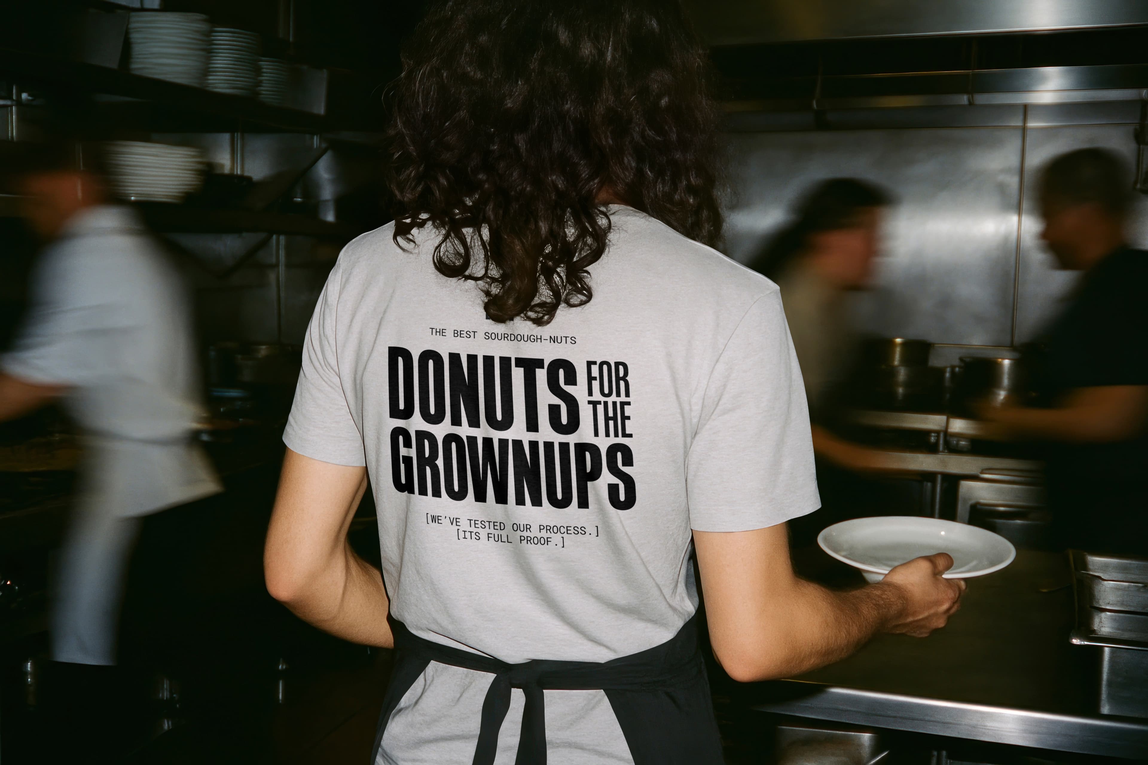
An identity system for a doughnut venue that looks like a chrome kitchen, and refuses to use the colour pink.
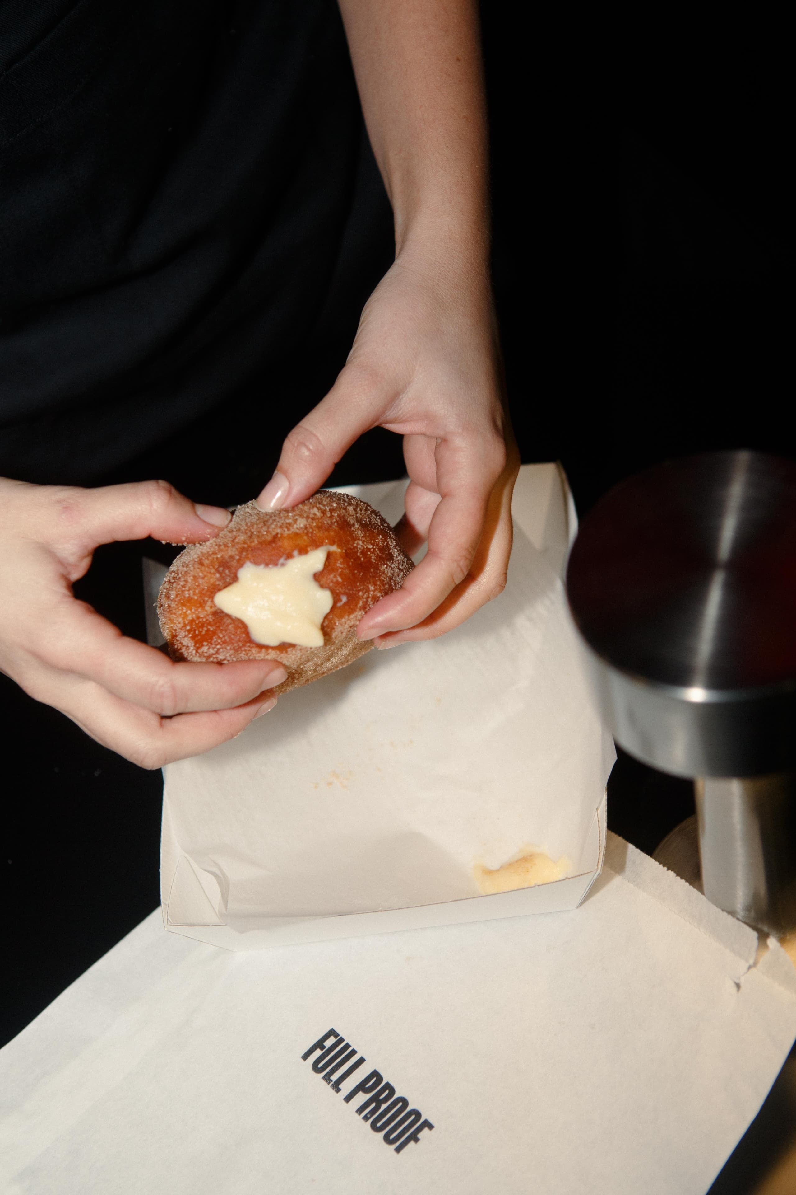
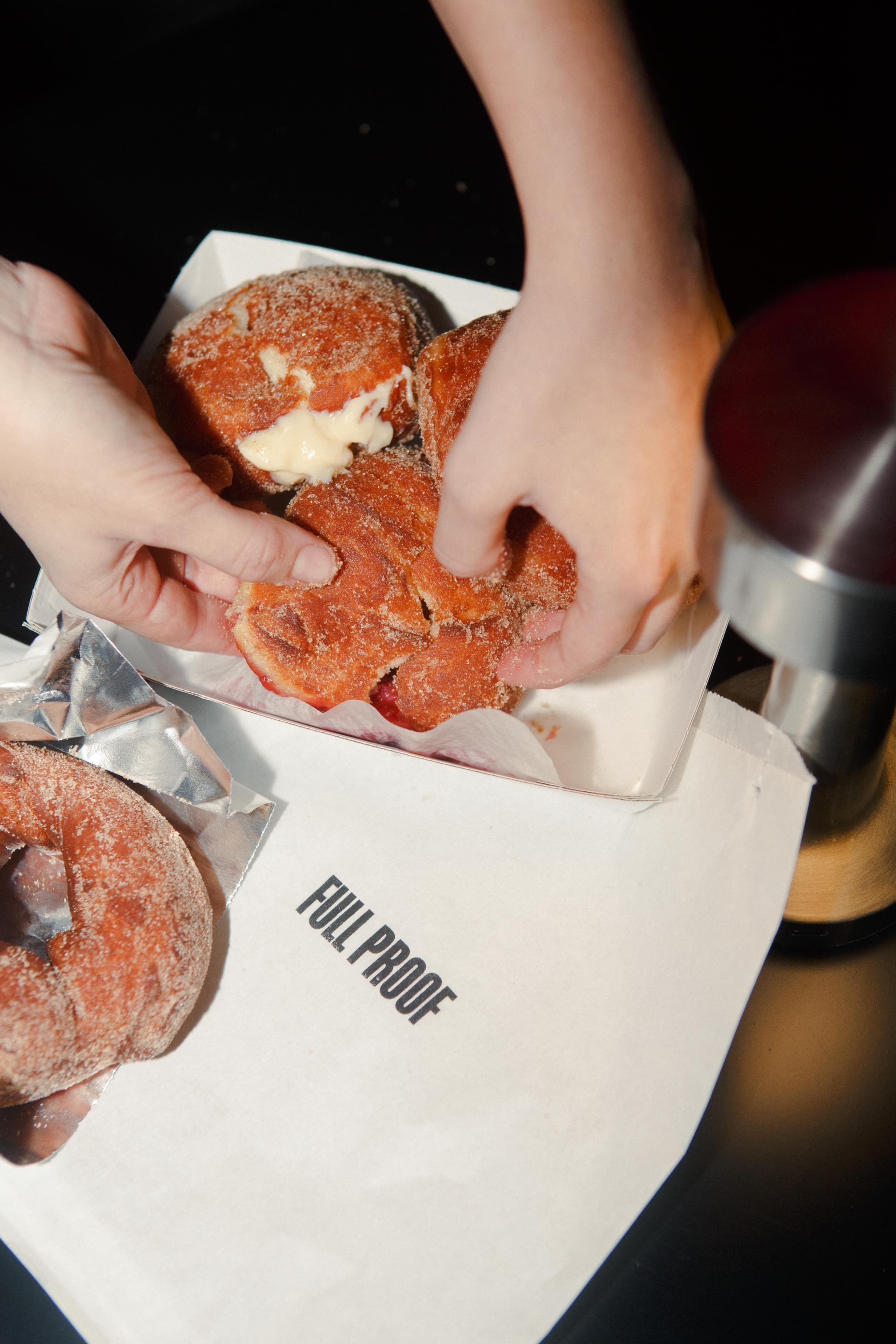
Full Proof is a sourdough doughnut venue in Potts Point, Sydney. The founders came to us with a brand name built around the idea that their process was impervious to failure, a decade of hospitality experience, and a very clear sense of what they didn’t want to be: the pastel colours, decorative typography, and confectionary energy that the doughnut category defaults to. The brief was to build an identity for a venue that needed to work as a morning commute pitstop and an after-dinner destination in the same space, with the same brand, without either version feeling like a compromise.
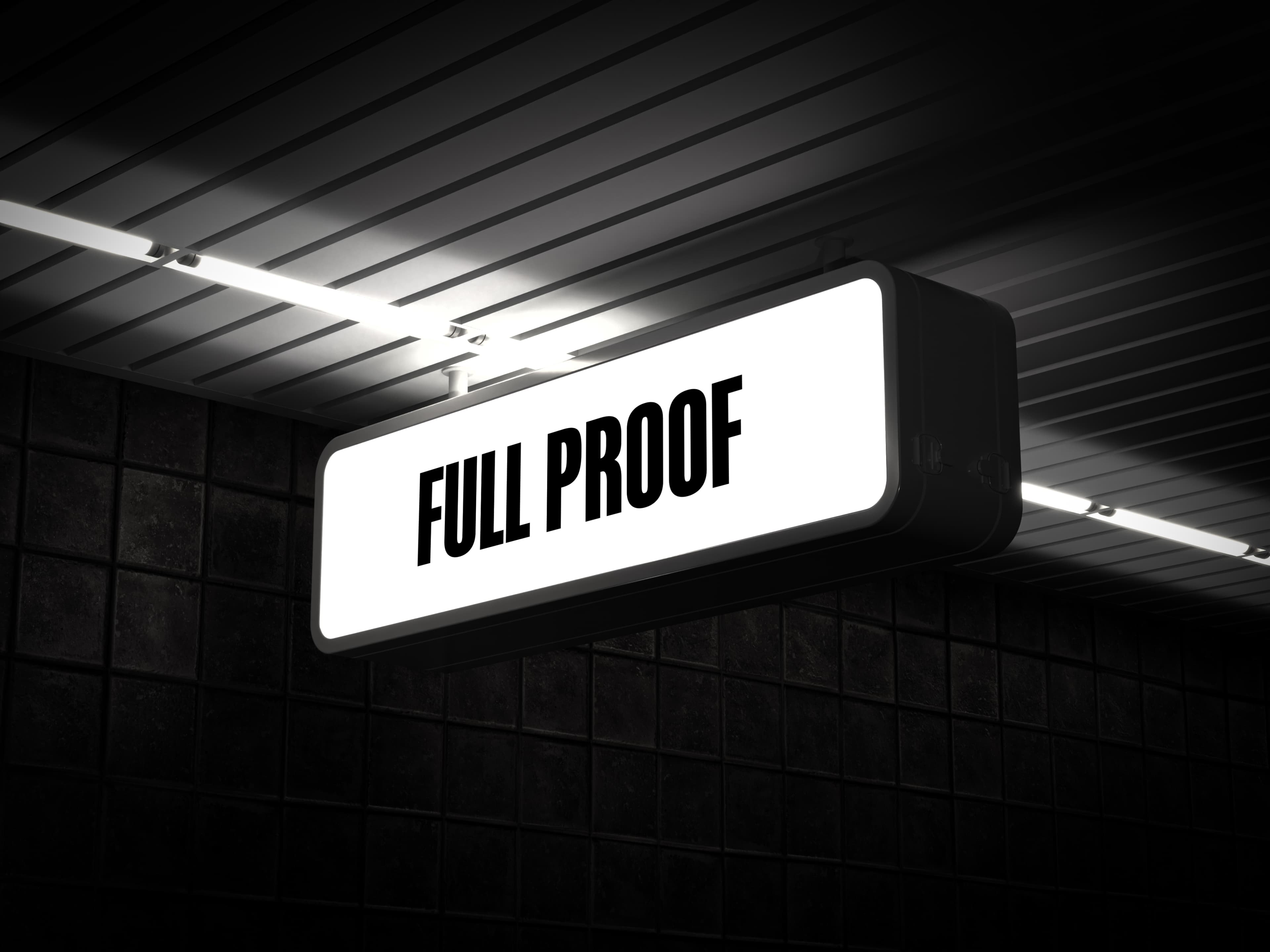
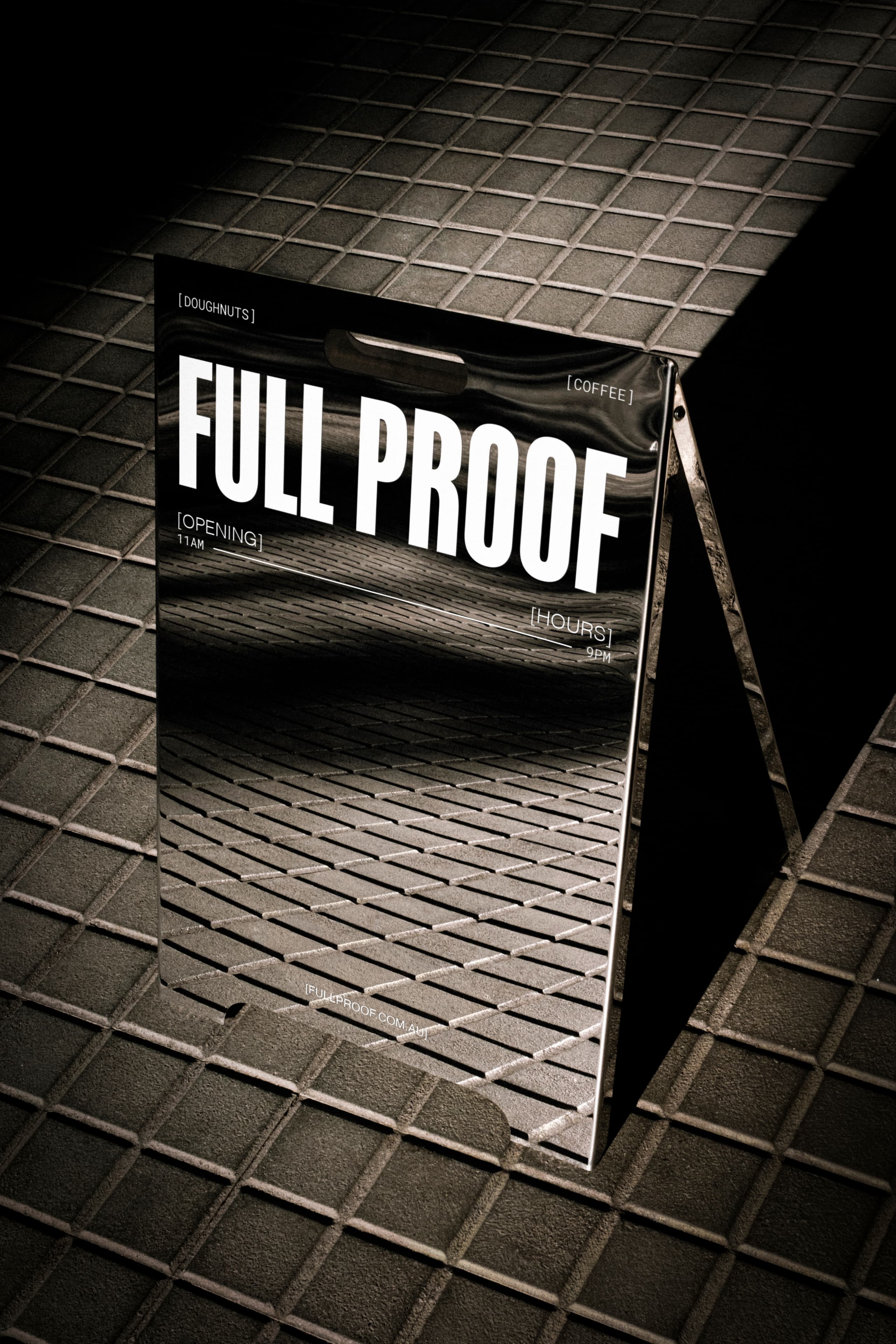
We presented three creative directions. The founders were originally drawn to a mid-century jazz bar posture that matched the soul music and moody atmosphere they’d envisioned for the venue. The direction they chose was “The Chemistry Chrome Bakery”, a precision-industrial concept drawn from the stainless steel and chrome surfaces of a working kitchen. It won because it felt most congruent with the name.
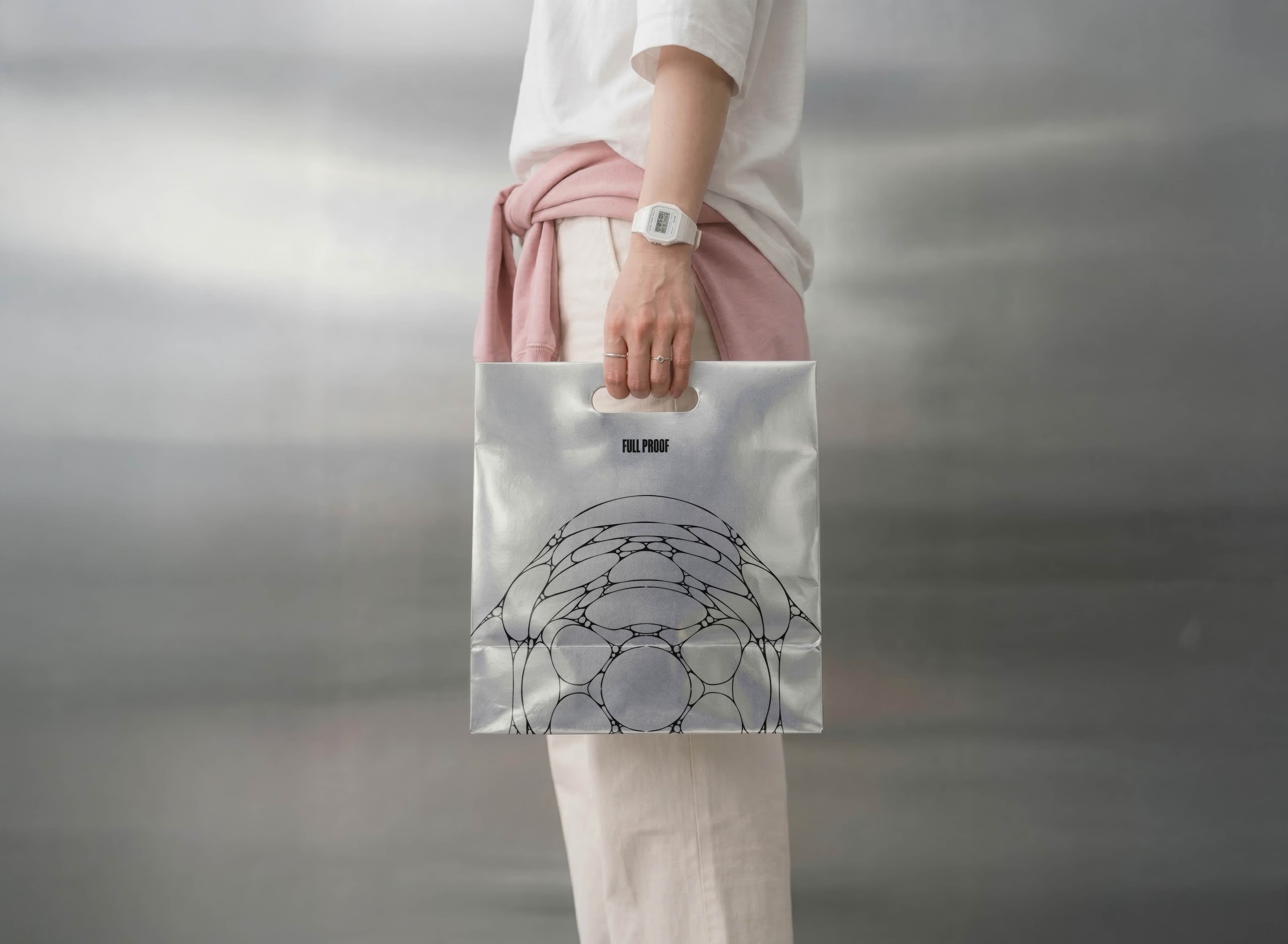
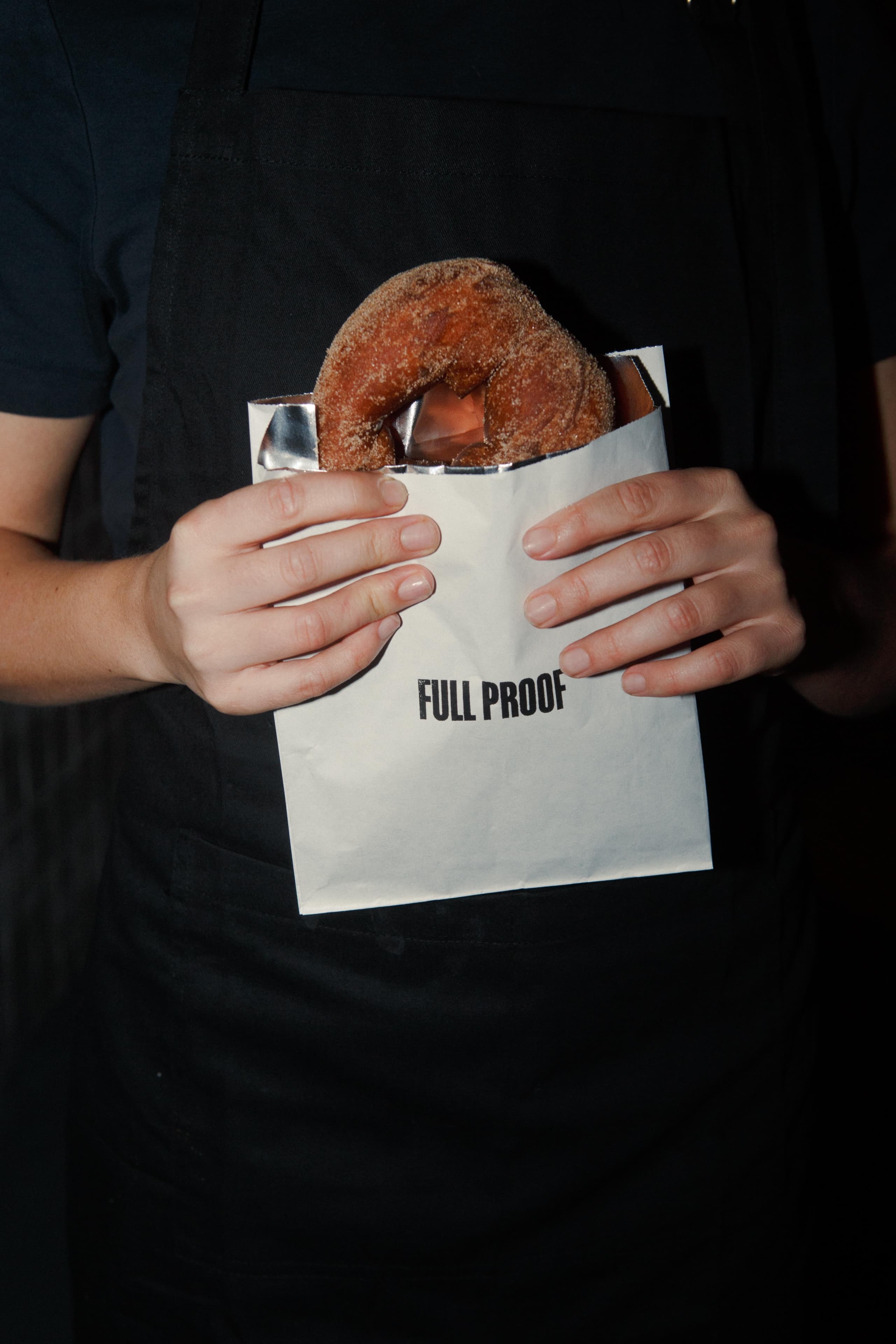
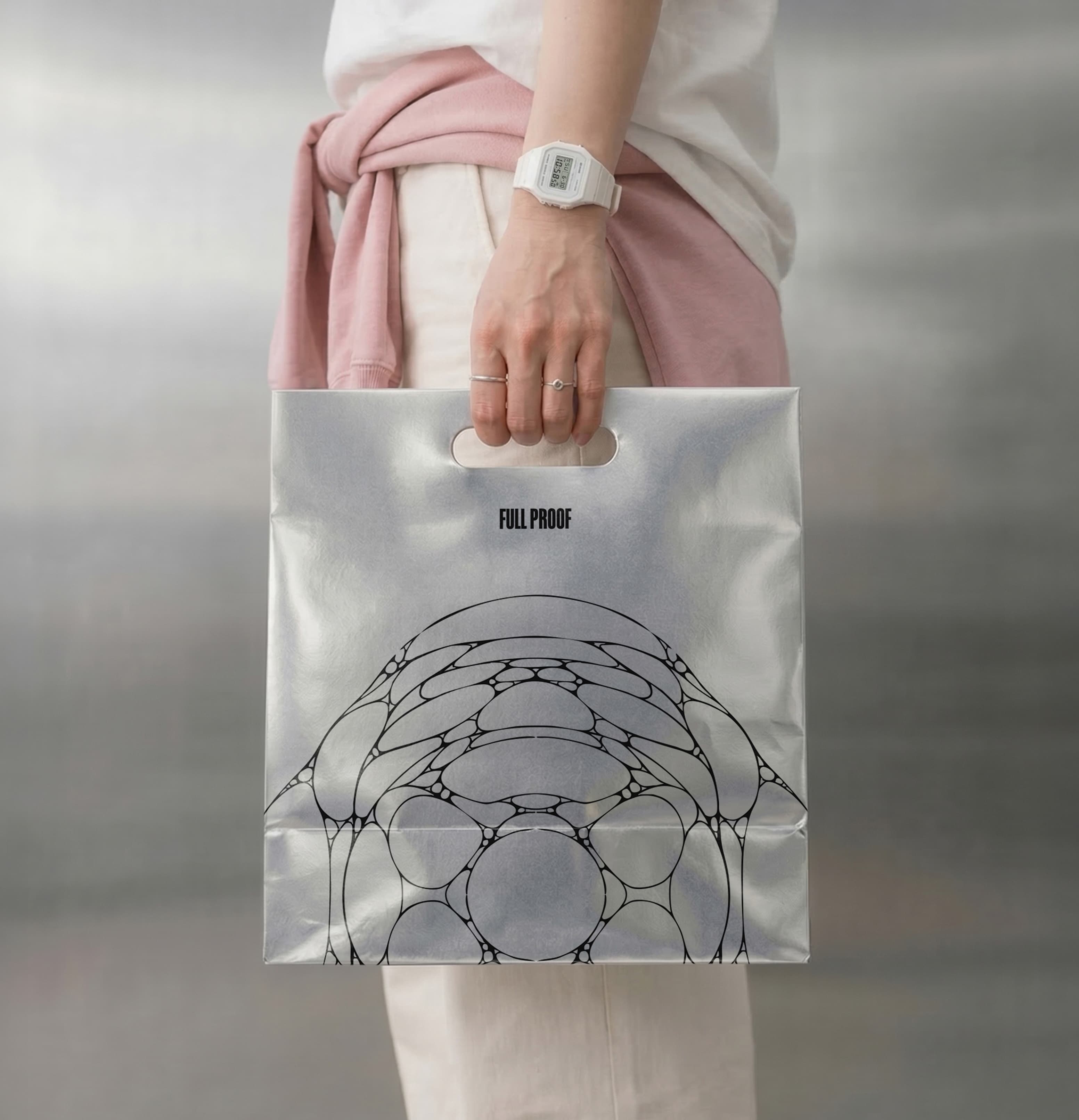
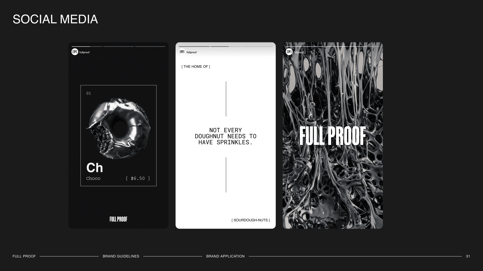
The wordmark is a customised cut of Tandelle with the softer terminals replaced by hard, angular diagonal shears. The [FP] lettermark uses square brackets borrowed from the technical notation that runs through the identity system. The palette is monochromatic, drawn from brushed metal and chrome rather than the pinks and pastels of the broader category or the navy and teal that Sydney’s nearest competitors had already claimed. The brand shape is derived from the cellular structure of proofed sourdough, abstracted into a graphic pattern that connects the identity to the craft without being too explicit.
To read more about our branding services, you can learn more here.