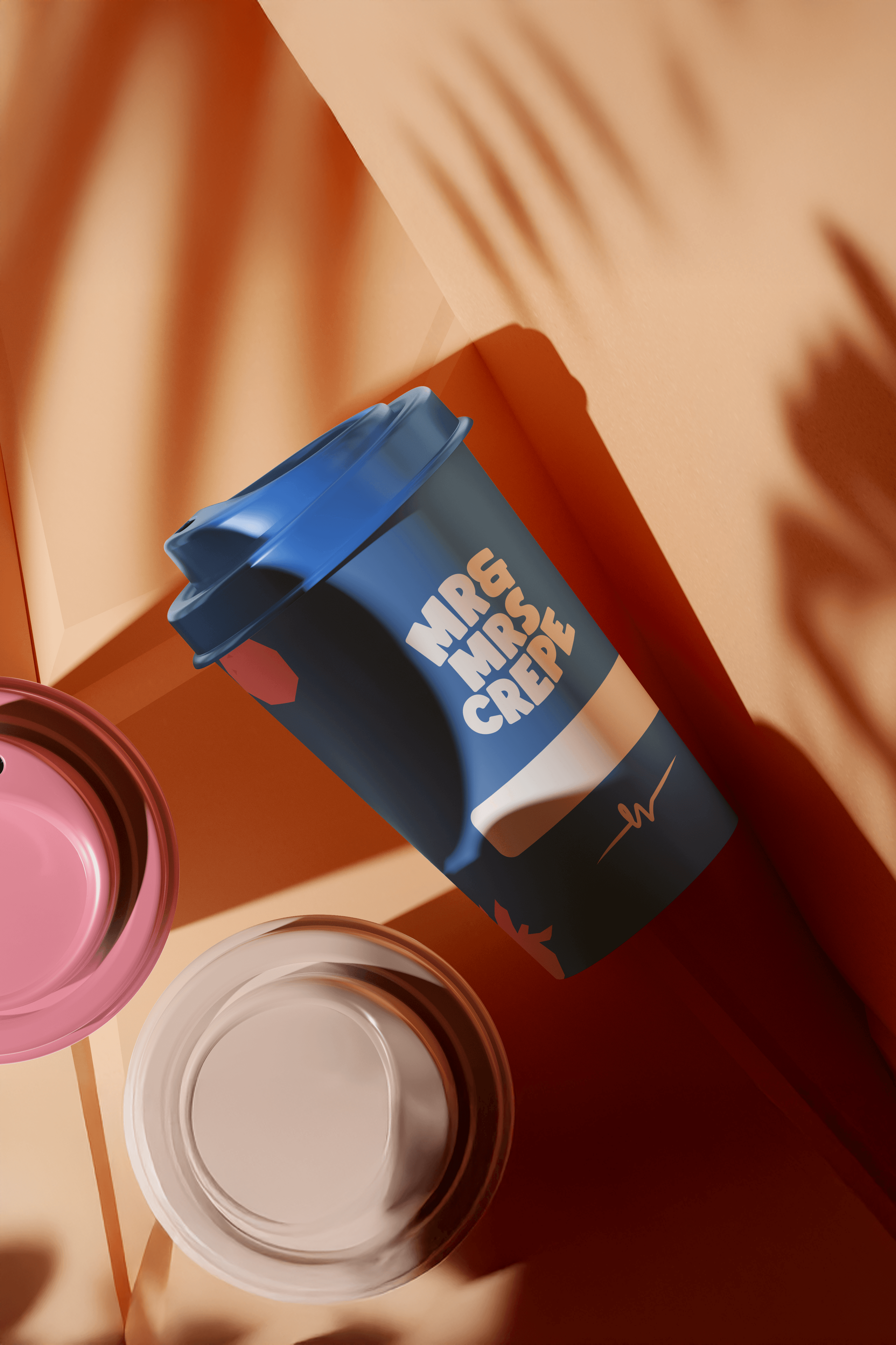
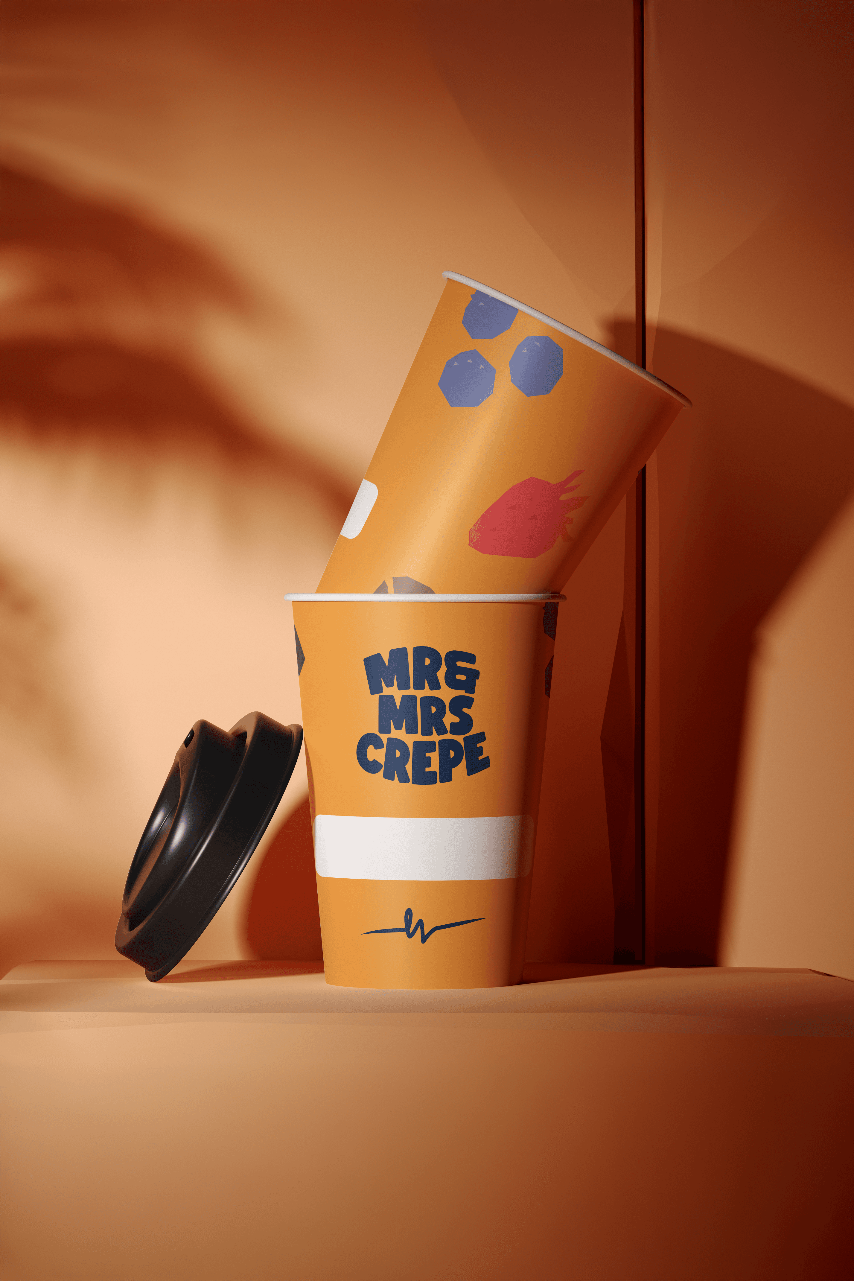
Vibrant new hospitality franchise, Mr & Mrs Crepe, approached us to craft a bold and joyful brand identity as they transformed a former eatery into a buzzing hub of flavour. Inspired by the carefree spirit of a European summer, the founder envisioned something playful and eye-catching that would captivate both the eyes and the appetite of passersby.
Specialising in crepes, pancakes, waffles, and an array of savoury breakfast delights, Mr & Mrs Crepe needed branding that evoked joy and invited people to stop in their tracks for a moment of indulgence. We brought this vision to life through playful illustrations set against bright, punchy backgrounds, paired with a dynamic mix of bold sans-serif and elegant script fonts. The result was a delectable brand style guide, packaging, and collateral that strike the perfect balance between fun and sophistication – effortlessly turning heads and sparking smiles.
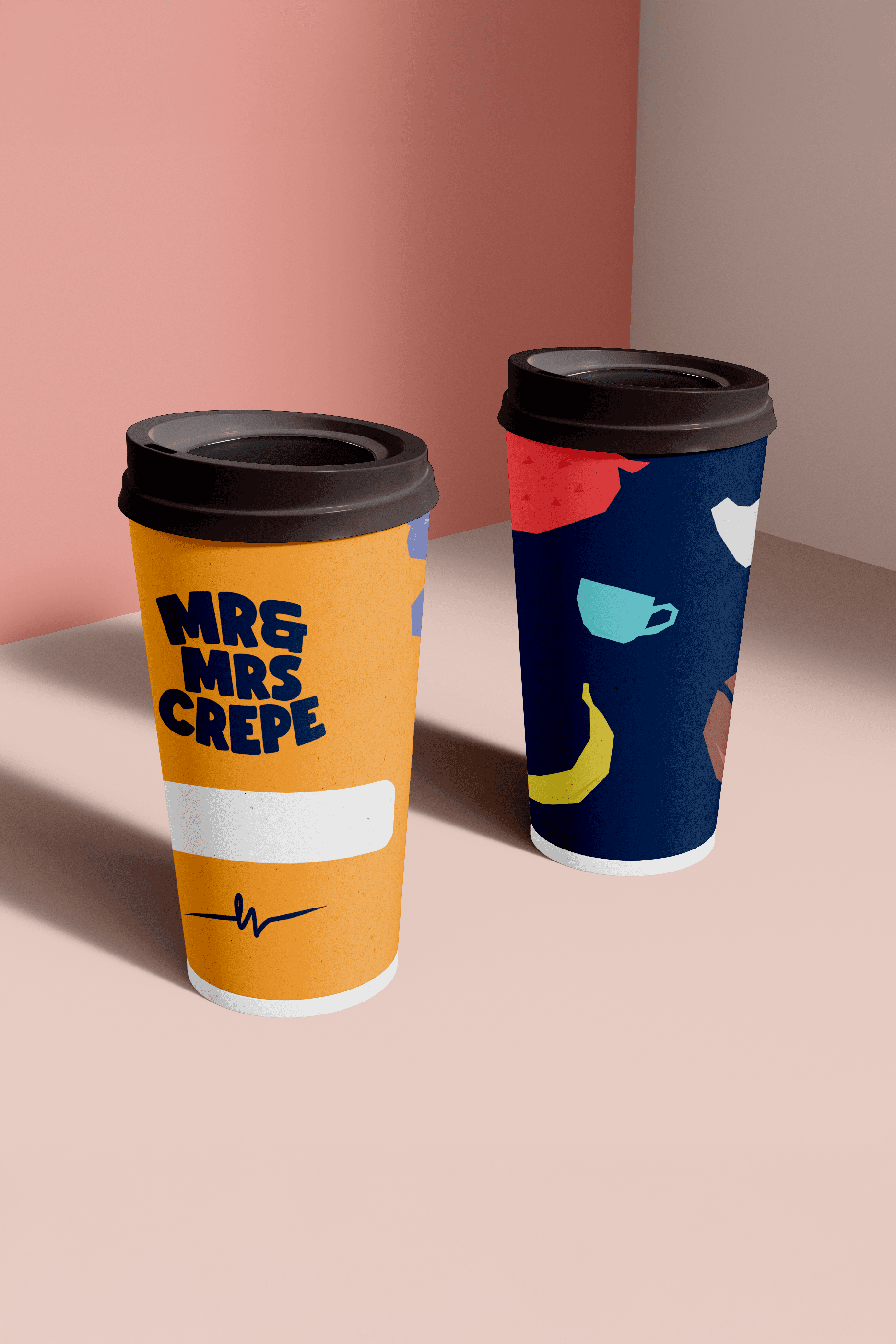
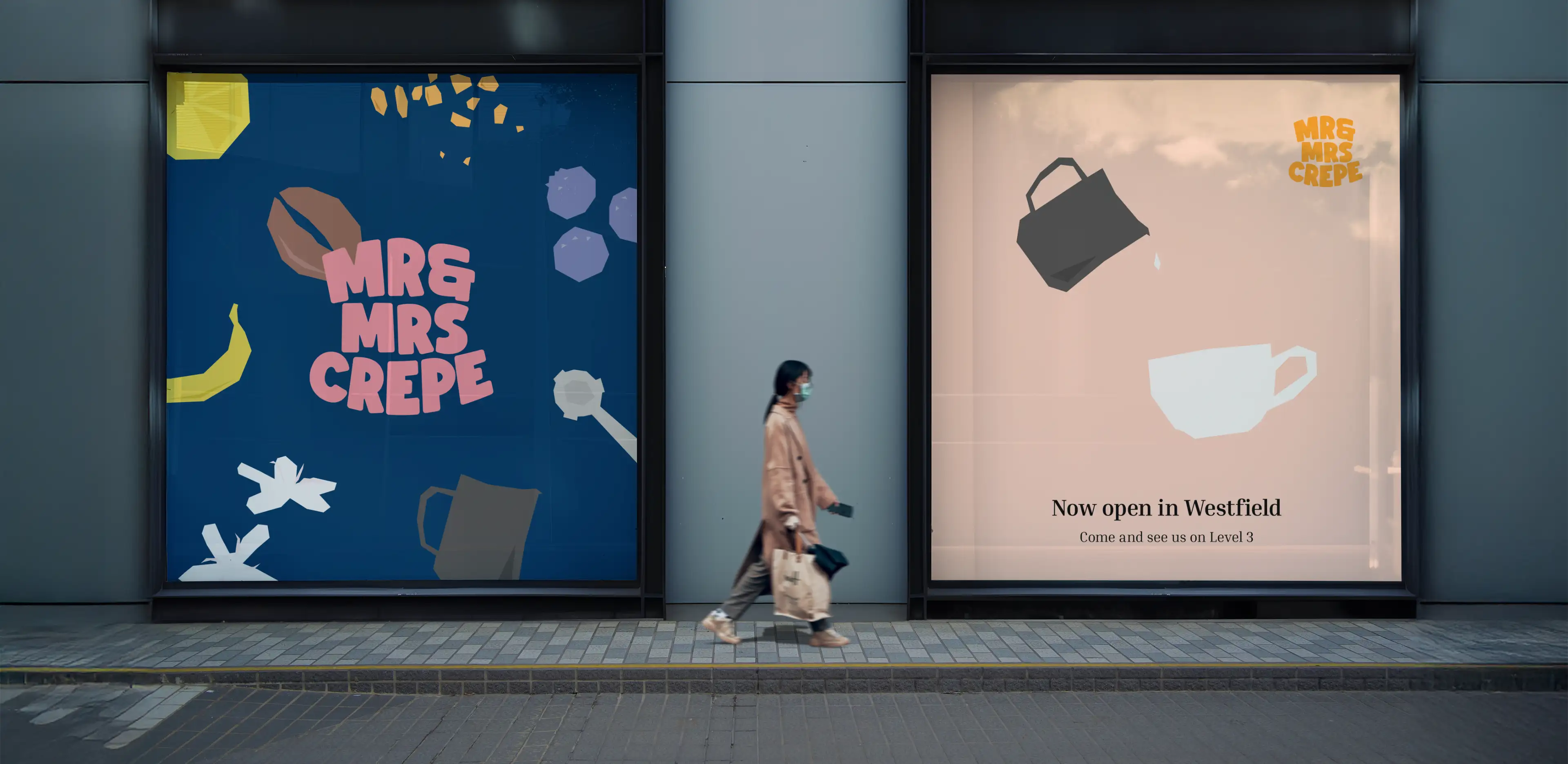
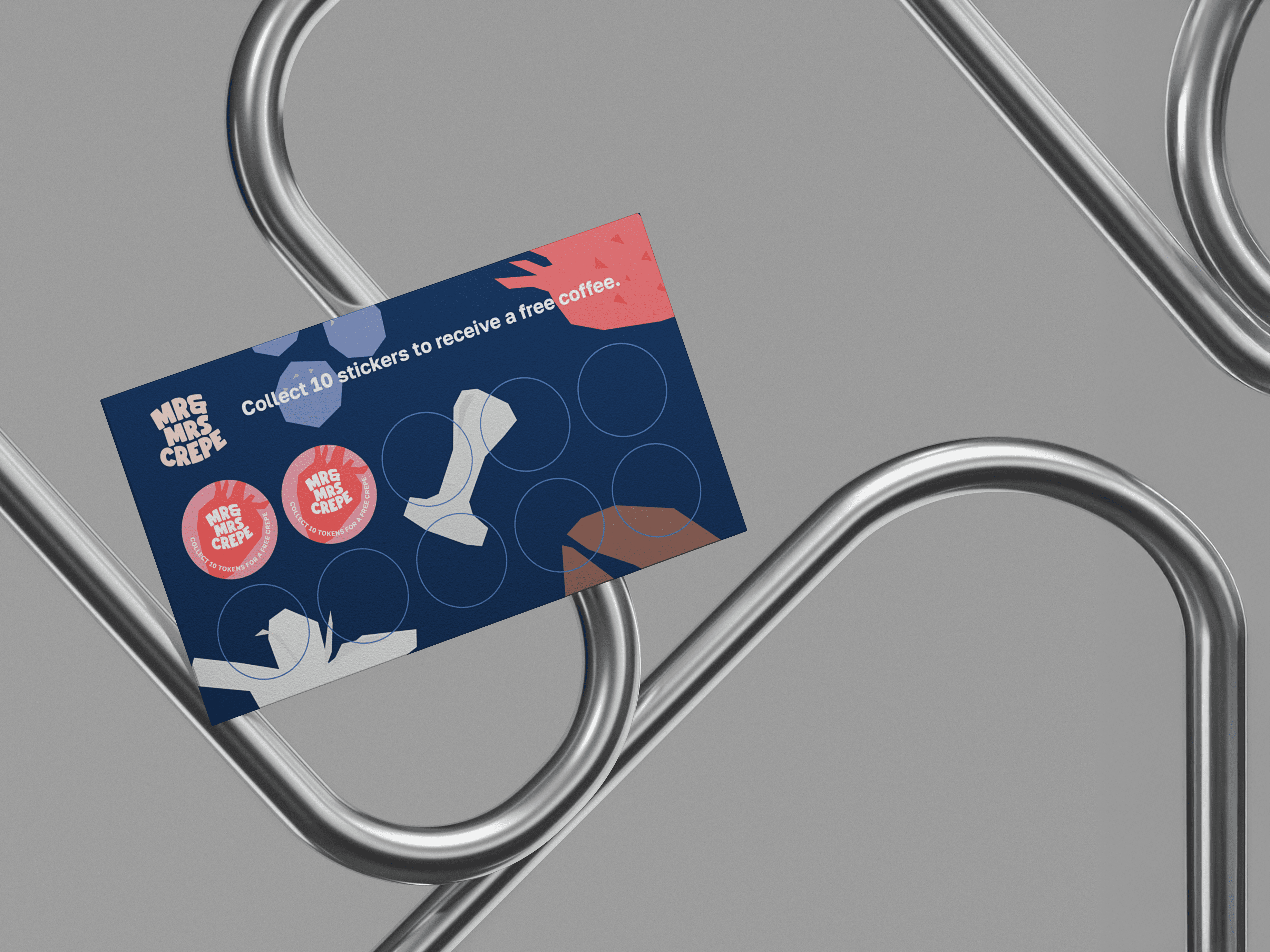
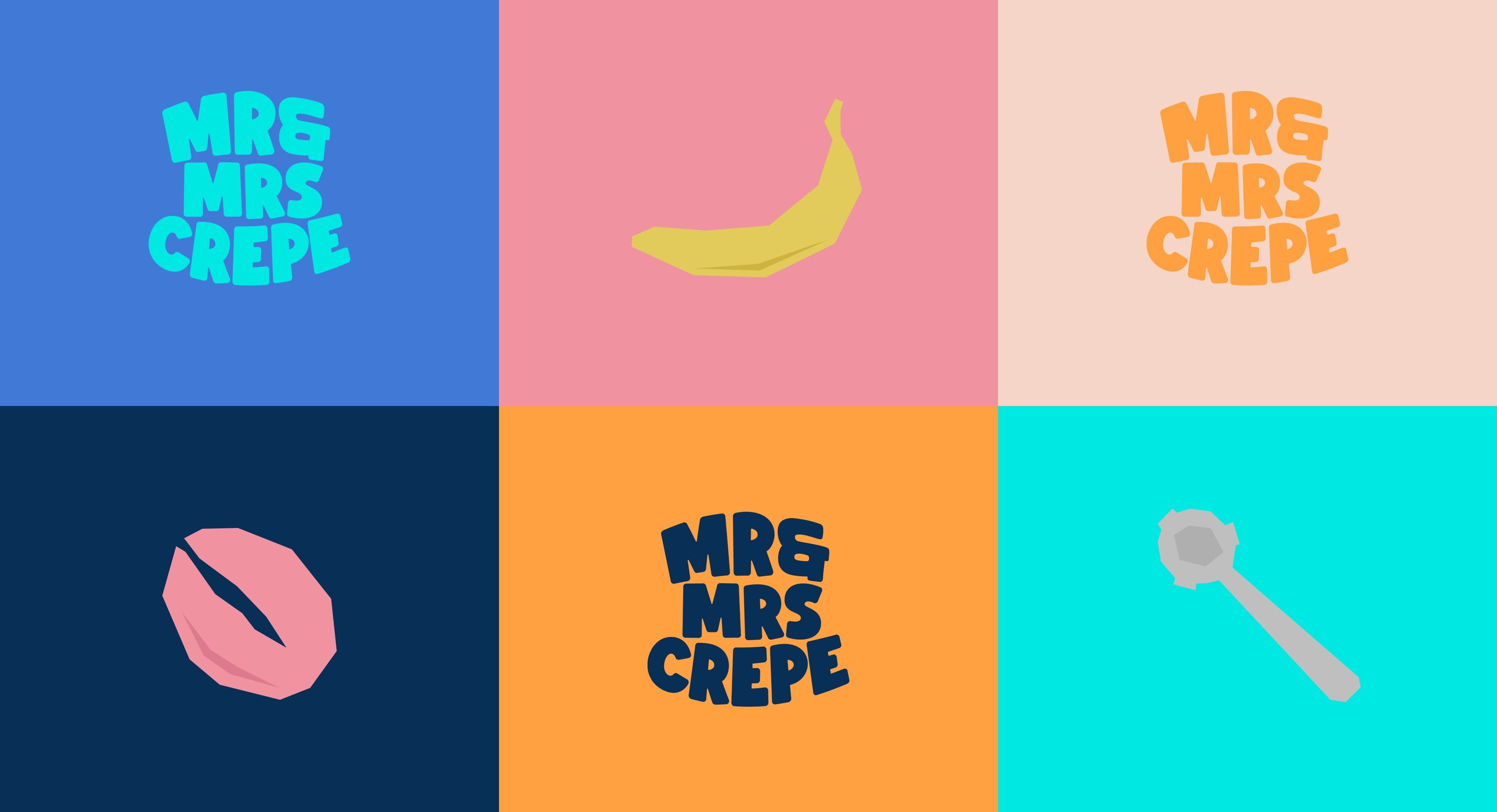
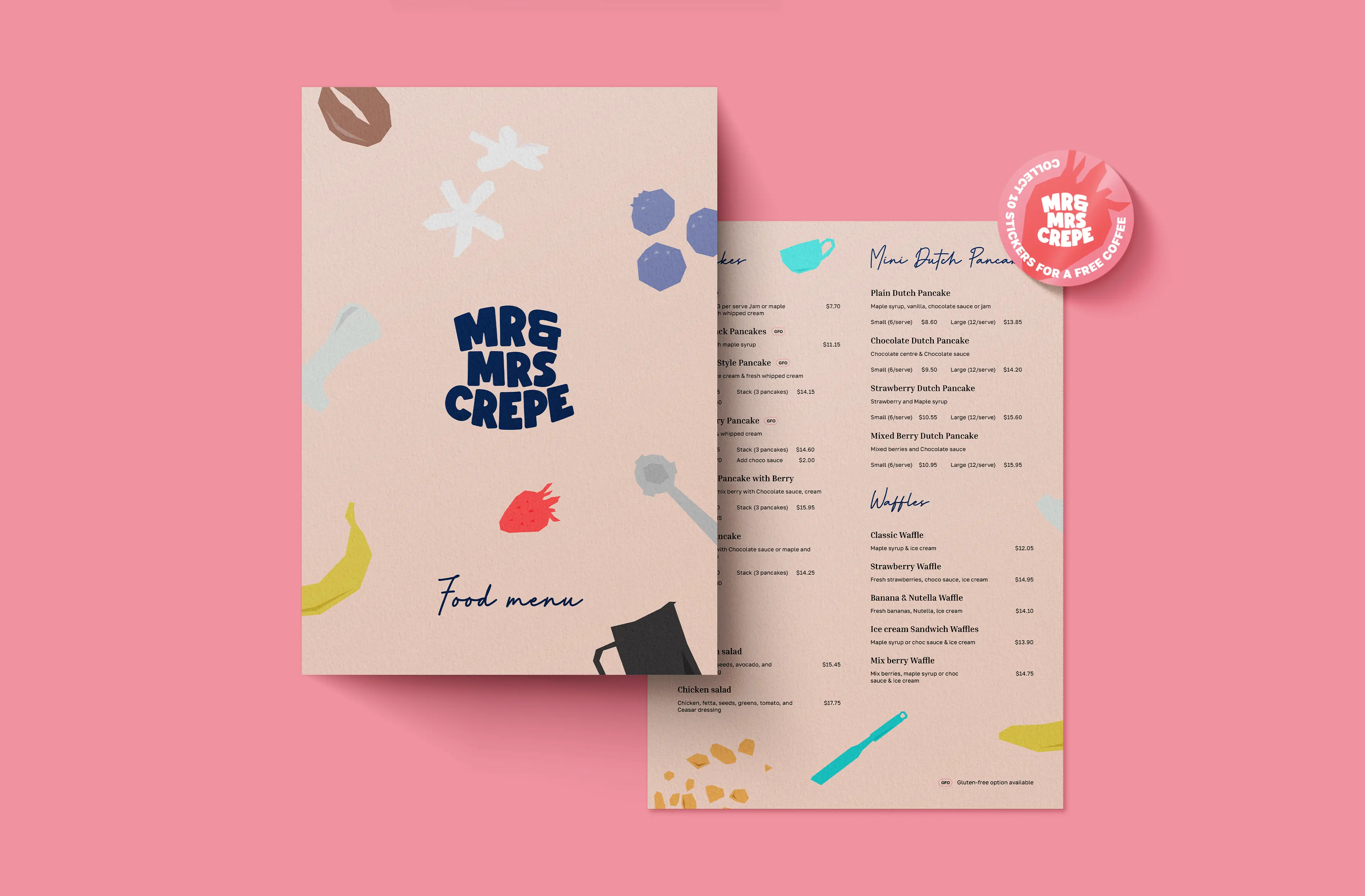
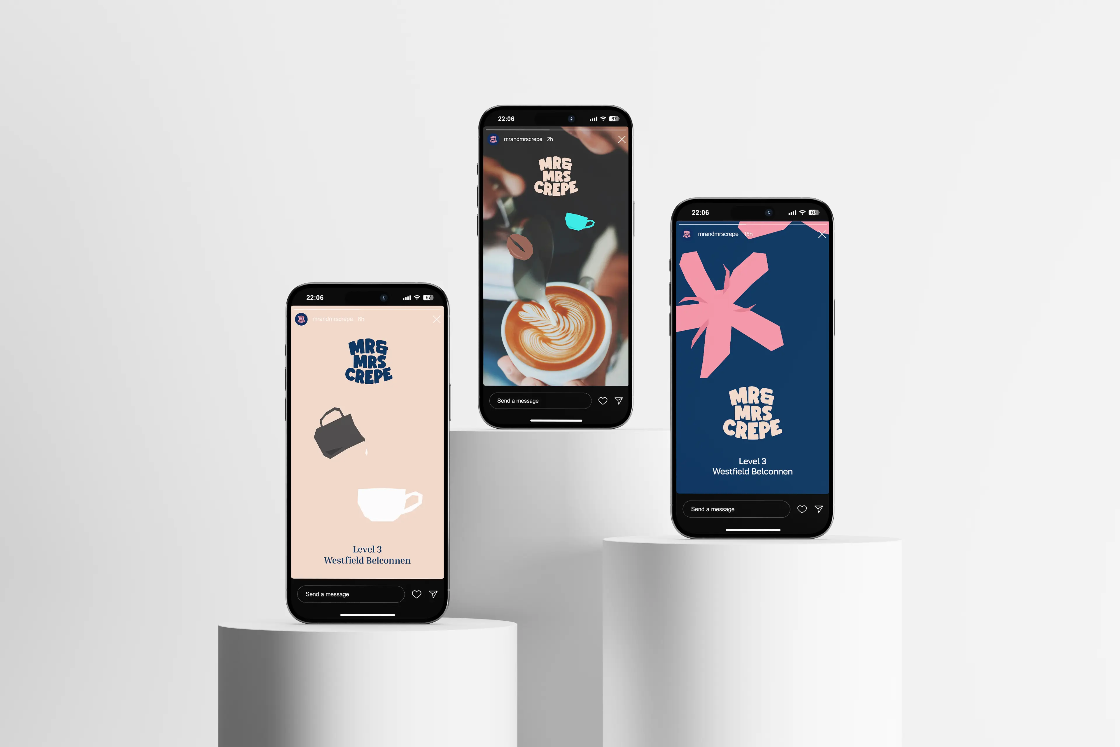
Drawing inspiration from this vision, we crafted a brand identity that feels both whimsical and polished. With colours named after the French Riveria and famous dessert combinations, every inch of the brand style guide was thought out to compliment it’s long term use as business booms and the brand spreads.
